Pure CSS gradient circle border

4.9k views Asked by At

I have this UI requirement enter image description here

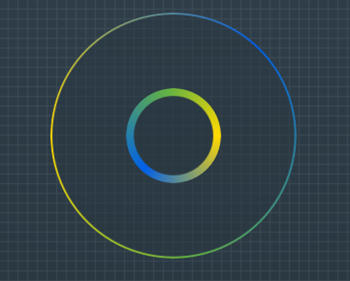
At the moment, I have a working solution of a div (with a fixed height and width and a background image for the outer gradient border) and a pseudo element, positioned absolute with a background image of the inner border.

.div {
    position: relative;
    width: 254px;
    height: 254px;
    border: 2px solid transparent;
    border-radius: 50%;
    background: url(../img/gradient_border_circle.png) no-repeat 50%;
}
div:before {
    content: "";
    position: absolute;
    top: 50%;
    transform: translate(-50%,-50%);
    left: 50%;
    width: 98px;
    height: 98px;
    border-radius: 50%;
    background: url(../img/gradient_border_circle_inner.png) no-repeat 50%;
}

However, am looking for a more elegant solution (pure css or svg gradient?) without the use of background images where the gradient can scale with no pixelation.

I have researched and closest I have come across is https://codepen.io/nordstromdesign/pen/QNrBRM and Possible to use border-radius together with a border-image which has a gradient? But I need a solution where the centre is transparent in order to show through the page's background

Update: Ideally, am looking for a solution with relatively good support in all modern browsers.

3

There are 3 answers

0
Mohammad Usman On BEST ANSWER

SVG is the recommended way to create a circle shape and draw gradient outline / border around it.

SVG has a circle element that can be used to draw a circle shape. This shape can be filled and outlined with a solid color, gradient or pattern.

* {box-sizing: border-box;}

body {
  background: linear-gradient(#333, #999);
  text-align: center;
  min-height: 100vh;
  padding-top: 10px;
  margin: 0;
}
svg {vertical-align: top;}
<svg width="210" height="210">
  <defs>
    <linearGradient id="grad1" x1="0" y1="1" x2="1" y2="0">
      <stop offset="0" stop-color="#f5d700" />
      <stop offset="1" stop-color="#0065da" />
    </linearGradient>
    <linearGradient id="grad2" xlink:href="#grad1" x1="1" y1="0" x2="0" y2="1"></linearGradient>
  </defs>
  <g fill="none">
    <circle cx="100" cy="100" r="95" stroke="url(#grad1)" stroke-width="2" />
    <circle cx="100" cy="100" r="40" stroke="url(#grad2)" stroke-width="5" />
  </g>
</svg>

1
ishegg On

You can use a mask to achieve what you're looking for. You will need an SVG file with a transparent circle. Here I used an image from the internet, but you can make your own to accommodate your needs:

mask: url(circle.svg);
0
Temani Afif On

Here is a CSS only solution that should work fine in all modern browsers (tested on Chrome, Firefox and Edge)

.box {
  --it:20px; /* thickness of inner gradient */
  --ot:10px; /* thickness of outer gradient */
  --s:30%;   /* starting point of inner gradient */

  width:200px;
  display:inline-flex;
  box-sizing:border-box;
  border-radius:50%;
  border:var(--ot) solid transparent;
  background:
      /* inner gradient clipped to the padding area */
      conic-gradient(red,blue,green,red) padding-box,
      /* outer gradient visible on the border area */
      conic-gradient(purple,yellow,orange,purple) border-box;
      
  -webkit-mask:radial-gradient(farthest-side,
    transparent var(--s), 
    #fff   calc(var(--s) + 1px)  
           calc(var(--s) + var(--it)),
    #fff0  calc(var(--s) + var(--it) + 1px) 
           calc(100% - var(--ot)), 
    #fff   calc(100% - var(--ot) + 1px));
}
/* keep the ratio */
.box::before {
  content:"";
  padding-top:100%;
}

body {
  background:pink;
}
<div class="box"></div>
<div class="box" style="--s:5%;--ot:20px;width:150px;"></div>
<div class="box" style="--s:calc(100% - 20px);--it:10px;width:220px;"></div>
<div class="box" style="--s:0%;--it:50%;width:80px;"></div>

I am adding 1px in the calculation to avoid jagged edges. You can replace the conic-gradient() with another type of gradient or even an image