Why does my CSS radial-gradient pattern break when it is a rectangle?

951 views Asked by At

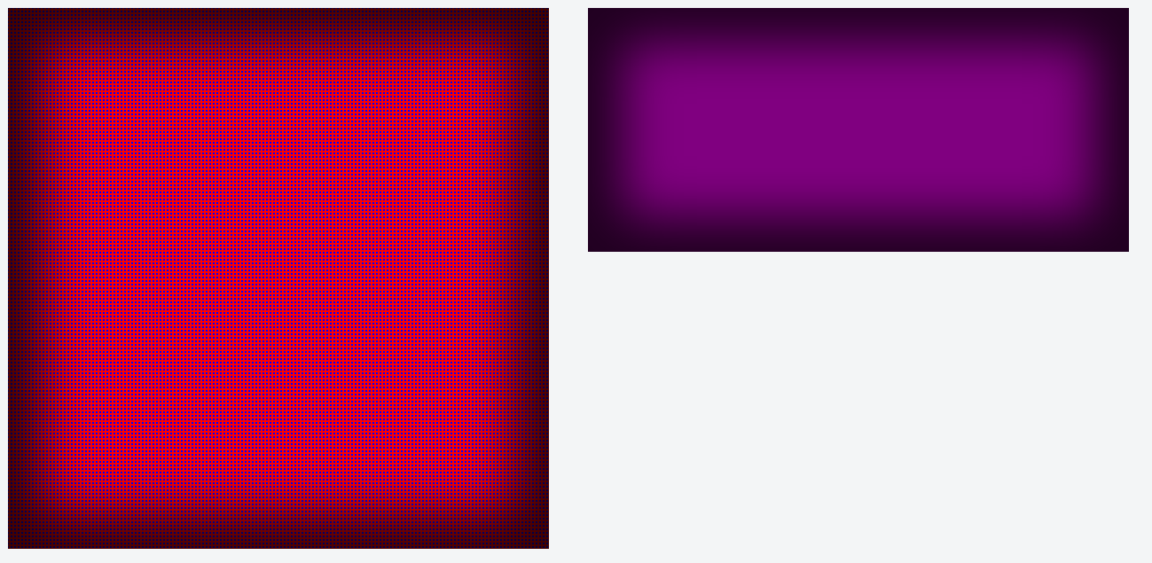
I have a box with a radial-gradient dot pattern background. When I use the property padding-bottom: 100% to make it a square, the dot pattern works as expected. When switching to mobile devices, I need this box to be a rectangle, so I changed the padding-bottom to 45%. At 45% the dot pattern is not visible, and if the padding-bottom is anything less than 75% the dot pattern will not show at all. Why is that? What can be done to make the desired effect work. Ideally the pattern would work for any sized box.

Here is a jsfiddle that shows the problem> https://jsfiddle.net/. The red square box has the dot pattern, while the rectangular purple box has no dots.

Any insights or advice would be greatly appreciated.

Here is an image that shows what I am describing:

enter image description here

1

There are 1 answers

2
Kiran Dash On BEST ANSWER

I thought of a workaround to create a square psuedo element(::before) and apply the repeating radial background to that and add overflow: hidden to the rectangle class. I hope this might help you.

Note: Make sure that the width and height of ::before element is larger than the main element.

  .box {
    background: blue repeating-radial-gradient( red, red 2px, transparent 2px, transparent 100%);
    background-size: 4px;
    padding-bottom: 100%;
    position: relative;
  }
  
  .box:after {
    box-shadow: inset 0 0 90px 40px rgba(0, 0, 0, .75);
    content: '';
    height: 100%;
    left: 0;
    position: absolute;
    top: 0;
    width: 100%;
  }
  
  .container {
    width: 610px;
    height: 385px;
    display: inline-block;
    margin: 20px;
    
  }
  
  .rectangle {
    padding-bottom: 45%;
    position: relative;
    overflow: hidden;
  }
  .rectangle:before {
    content: '';
    left: 0;
    position: absolute;
    top: 0;
    width: 1000px;
    height: 1000px;
    background: green repeating-radial-gradient( purple, purple 2px, transparent 2px, transparent 100%);
    background-size: 4px;
    z-index: 0;
  }  
  .rectangle:after {
    box-shadow: inset 0 0 90px 40px rgba(0, 0, 0, .75);
    content: '';
    height: 100%;
    left: 0;
    position: absolute;
    top: 0;
    width: 100%;
    z-index: 1;
  }
<div class="container">
  <div class="box"></div>
</div>

<div class="container">
  <div class="rectangle"></div>
</div>