Make Label/TextBlock readable on glass using blur effect

5.2k views Asked by At

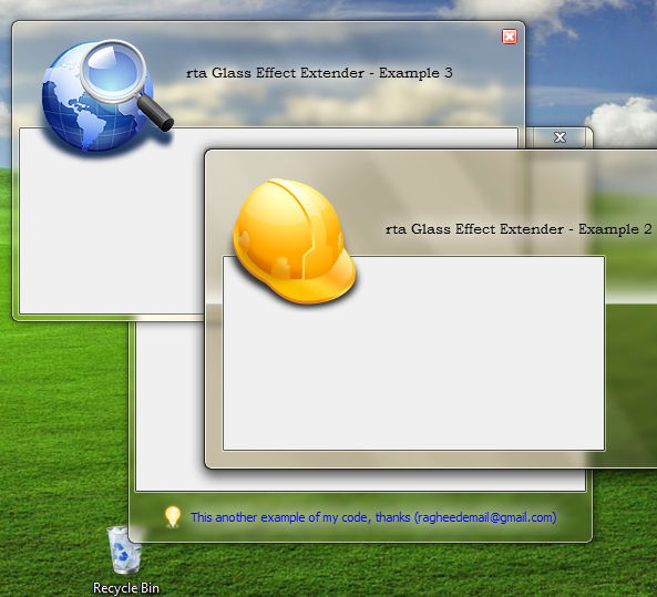
I'm using WPF 3.5 SP1 and I want to achieve something like this (the glass-part is already done):


(source: ggpht.com)

(Source)


(Source)

You can see nice blur around the text, which makes it very well readable. I also found out that correct approach is to use API DrawThemeTextEx, which renders the blur using recommended system options. However, how can I achieve the same effect using WPF?

I was able to find these links which contain helpful resources:
How to make WPF text on Aero glass background readable?
Glowing Label Controls On A Glass Surface

They do it by duplicating the TextBlock, and setting a Blur effect on it. However, this is not a real solution. Here is how it looks like:

Compare the result effect with the images above, and you will see the solution is still far away. So how can I properly get the desired effect using WPF? I'm fine with emulation (no use of DrawThemeTextEx API), as far as the result is pretty similar.

Thank you.

4

There are 4 answers

3
Jaroslav Jandek On BEST ANSWER
    <TextBlock ...>
        <TextBlock.Effect>
            <DropShadowEffect BlurRadius="10" Color="White" ShadowDepth="0" />
        </TextBlock.Effect>
    </TextBlock>
1
Tom Dudfield On

How about something along these lines where you have a rectangle behind your text that blurs slightly, I have used this a few times. I find it makes it more readable because the blur covers a bigger area.

            <Grid>
                <Rectangle Fill="#8FFFFFFF"
                           Stroke="{x:Null}"
                           StrokeThickness="0"
                           VerticalAlignment="Center"
                           Width="{Binding ActualWidth, ElementName=PART_Title, Mode=Default}"
                           Height="{Binding ActualHeight, ElementName=PART_Title, Mode=Default}"
                           RadiusX="2"
                           RadiusY="2">
                    <Rectangle.Effect>
                        <BlurEffect Radius="10" />
                    </Rectangle.Effect>
                </Rectangle>

                <TextBlock x:Name="PART_Title"
                           Text="{Binding Title}"
                           Foreground="Black"
                           TextWrapping="NoWrap"
                           TextTrimming="CharacterEllipsis" />
            </Grid>
0
Triynko On

I was having trouble implementing the decorator as it stood in Paya's answer, so I show how it can be wrapped in a complete, ready-to-use style resource that can be applied to any label, which will display the glass effect, and will also dim the label when disabled and preserve the alignment, border, etc.:

<Style x:Key="GlassLabelStyle" TargetType="{x:Type Label}">
    <Setter Property="Template">
        <Setter.Value>
            <ControlTemplate TargetType="{x:Type Label}">
                <Border BorderBrush="{TemplateBinding BorderBrush}" 
                BorderThickness="{TemplateBinding BorderThickness}" 
                Background="{TemplateBinding Background}" 
                Padding="{TemplateBinding Padding}" SnapsToDevicePixels="True">
                    <Grid>
                        <Decorator>
                            <Decorator.Effect>
                                <DropShadowEffect BlurRadius="7" Color="White" ShadowDepth="0" />
                            </Decorator.Effect>
                            <Decorator>
                                <Decorator.Effect>
                                    <DropShadowEffect BlurRadius="7" Color="White" ShadowDepth="0" />
                                </Decorator.Effect>
                                <Decorator>
                                    <Decorator.Effect>
                                        <DropShadowEffect BlurRadius="7" Color="White" ShadowDepth="0" />
                                    </Decorator.Effect>
                                    <ContentPresenter ContentTemplate="{TemplateBinding ContentTemplate}" 
                    Content="{TemplateBinding Content}" ContentStringFormat="{TemplateBinding ContentStringFormat}" 
                    HorizontalAlignment="{TemplateBinding HorizontalContentAlignment}" RecognizesAccessKey="True" 
                    SnapsToDevicePixels="{TemplateBinding SnapsToDevicePixels}" 
                    VerticalAlignment="{TemplateBinding VerticalContentAlignment}">
                                    </ContentPresenter>
                                </Decorator>
                            </Decorator>
                        </Decorator>
                    </Grid>
                </Border>
                <ControlTemplate.Triggers>
                    <Trigger Property="IsEnabled" Value="False">
                        <Setter Property="Foreground" Value="{DynamicResource {x:Static SystemColors.GrayTextBrushKey}}"/>
                        <Setter Property="Opacity" Value="0.5"/>
                    </Trigger>
                </ControlTemplate.Triggers>
            </ControlTemplate>
        </Setter.Value>
    </Setter>
</Style>

If the style is in your window or app resources, then you can apply it like so:

<Label Style="{StaticResource GlassLabelStyle}"

And while I'm at it, I encountered an issue with TextBox's too, where you simply cannot alter the background color when the control is disabled (it just keeps reverting to white) so someone figured out that you have to override the entire template! See (https://stackoverflow.com/a/3752517/88409). So here is a ready-to-use style that will make a text box translucent when disabled (looks great on glass) and will make its background a semi-translucent white with a more visible border when enabled:

<SolidColorBrush x:Key="DisabledBackgroundBrush" Color="#01000000" />
<SolidColorBrush x:Key="DisabledBorderBrush" Color="#40000000" />
<SolidColorBrush x:Key="DisabledForegroundBrush" Color="#88ffffff" />

<Style x:Key="TextBoxStyle" TargetType="{x:Type TextBox}">
    <Setter Property="Background" Value="#88ffffff"/>
    <Setter Property="BorderBrush" Value="Black"/>
    <Setter Property="Template">
        <Setter.Value>
            <ControlTemplate TargetType="TextBox">
                <Border Name="Bd" BorderThickness="{TemplateBinding BorderThickness}" 
                                    BorderBrush="{TemplateBinding BorderBrush}" 
                                    Background="{TemplateBinding Background}" 
                                    SnapsToDevicePixels="true">
                    <ScrollViewer Name="PART_ContentHost" Background="{TemplateBinding Background}" 
                                SnapsToDevicePixels="{TemplateBinding SnapsToDevicePixels}" />
                </Border>
                <ControlTemplate.Triggers>
                    <Trigger Property="IsEnabled" Value="False">
                        <Setter Value="{StaticResource DisabledBackgroundBrush}" Property="Background" />
                        <Setter Value="{StaticResource DisabledBorderBrush}" Property="BorderBrush"/>
                        <Setter Value="{StaticResource DisabledForegroundBrush}" Property="Foreground" />
                        <Setter TargetName="PART_ContentHost" Property="Background" Value="{StaticResource DisabledBackgroundBrush}"/>
                        <Setter TargetName="PART_ContentHost" Property="BorderBrush" Value="{StaticResource DisabledBackgroundBrush}"/>
                    </Trigger>
                </ControlTemplate.Triggers>
            </ControlTemplate>
        </Setter.Value>
    </Setter>
</Style>
1
Paya On

As per Luke's request, I include the XAML for Decorators:

<Decorator>
    <Decorator.Effect>
        <DropShadowEffect BlurRadius="7" Color="White" ShadowDepth="0" />
    </Decorator.Effect>
    <Decorator>
        <Decorator.Effect>
            <DropShadowEffect BlurRadius="7" Color="White" ShadowDepth="0" />
        </Decorator.Effect>
        <Decorator>
            <Decorator.Effect>
                <DropShadowEffect BlurRadius="7" Color="White" ShadowDepth="0" />
            </Decorator.Effect>

            <ContentPresenter ContentTemplate="{TemplateBinding ContentTemplate}"
                    Content="{TemplateBinding Content}" ContentStringFormat="{TemplateBinding ContentStringFormat}" 
                    HorizontalAlignment="{TemplateBinding HorizontalContentAlignment}" RecognizesAccessKey="True" 
                    VerticalAlignment="{TemplateBinding VerticalContentAlignment}" />
        </Decorator>
    </Decorator>
</Decorator>

I created a ControlTemplate for a Label with the before-mentioned XAML, and used it everywhere I needed the text to glow.