Hi there, to reproduce this
:root{
    --black: rgb(11, 14, 17);
    --green: rgb(112, 228, 80);
    --gray: rgb(55, 55, 55);
}

*{
    margin: 0;
    padding: 0;
    box-sizing: border-box;
}

body{
    width: 100%;
    height: 100%;
    background-color: var(--black);
    color: #eee;
}

#rect-bar{
    width: 100%;
    display: flex;
    flex-direction: column;
    align-items: center;
    justify-content: center;
    border-radius: 15px;
    overflow: hidden;
}

#rect-bar .rect-row{
    width: 100%;
    height: 150px;
    display: flex;
    flex-direction: row;
    align-items: center;
    justify-content: center;
    /* border: 1px solid white; */
}

#rect-bar .rect-row .rect-cube{
    margin: 5px;
    width: 150px;
    height: 150px;
    border-radius: 15px;
    background-color: var(--green);
    /* border: 1px solid white; */
}

#rect-bar .rect-row .rect-cube.rcg{
    width: 120px;
    height: 120px;
    background-color: var(--gray);
}
<div id="rect-bar">
<div class="rect-row">
<div class="rect-cube rcg">
</div>
<div class="rect-cube">
</div>
</div>
<div class="rect-row">
<div class="rect-cube">
</div>
<div class="rect-cube rcg">
</div>
</div>
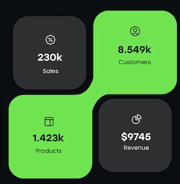
</div>I have been thinking of this all day, cannot figure out how the middle part of two green rectangles connect to each other.
I would be more than glad if u offer me some brilliant ideas.

Not really the best way i would have like, but this will work too.
So basically, create a 2x2 layout, style it as you like with border, background-color... and then add a fake layer under it to fill the gap with matching color of one of the matching opposite cubs.