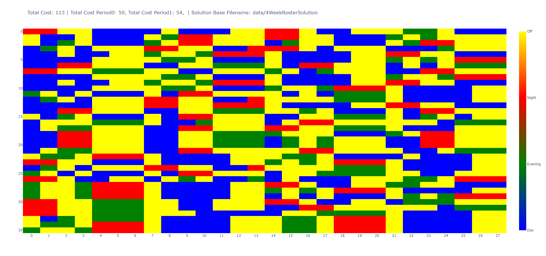
I have this code and would like the final plot to look something like this at the end. Unfortunately, I'm not getting anywhere. This is my code so far:
import pandas as pd
import plotly.express as px

# DF
dic = {(1, 1, 1): 1.0, (1, 1, 2): 0.0, (1, 1, 3): 0.0, (1, 2, 1): 0.0, (1, 2, 2): 1.0, (1, 2, 3): 0.0, (1, 3, 1): 0.0, (1, 3, 2): 0.0, (1, 3, 3): 0.0, (1, 4, 1): 0.0, (1, 4, 2): 1.0, (1, 4, 3): 0.0, (1, 5, 1): 1.0, (1, 5, 2): 0.0, (1, 5, 3): 0.0, (1, 6, 1): 0.0, (1, 6, 2): 1.0, (1, 6, 3): 0.0, (1, 7, 1): 0.0, (1, 7, 2): 1.0, (1, 7, 3): 0.0, (2, 1, 1): 1.0, (2, 1, 2): 0.0, (2, 1, 3): 0.0, (2, 2, 1): 1.0, (2, 2, 2): 0.0, (2, 2, 3): 0.0, (2, 3, 1): 1.0, (2, 3, 2): 0.0, (2, 3, 3): 0.0, (2, 4, 1): 0.0, (2, 4, 2): 0.0, (2, 4, 3): 0.0, (2, 5, 1): 1.0, (2, 5, 2): 0.0, (2, 5, 3): 0.0, (2, 6, 1): 0.0, (2, 6, 2): 0.0, (2, 6, 3): 1.0, (2, 7, 1): 0.0, (2, 7, 2): 1.0, (2, 7, 3): 0.0, (3, 1, 1): 1.0, (3, 1, 2): 0.0, (3, 1, 3): 0.0, (3, 2, 1): 0.0, (3, 2, 2): 1.0, (3, 2, 3): 0.0, (3, 3, 1): 0.0, (3, 3, 2): 0.0, (3, 3, 3): 0.0, (3, 4, 1): 1.0, (3, 4, 2): 0.0, (3, 4, 3): 0.0, (3, 5, 1): 1.0, (3, 5, 2): 0.0, (3, 5, 3): 0.0, (3, 6, 1): 1.0, (3, 6, 2): 0.0, (3, 6, 3): 0.0, (3, 7, 1): 0.0, (3, 7, 2): 1.0, (3, 7, 3): 0.0}
out = (pd.Series(dic, name='worked')
         .rename_axis(['person', 'day', 'shift'])
         .reset_index()
         .assign(shift=lambda x: x['shift'].where(x['worked'].eq(1), 0))
         .pivot_table(index='person', columns='day',
                      values='shift', aggfunc='sum')
       )
df = pd.DataFrame(out)

def Plot1(df):
    df_melted = df.reset_index().melt(id_vars=['person'], var_name='day', value_name='shift')

    fig = px.scatter(df_melted, x='day', y='person', color='shift', symbol='shift',
                     color_discrete_sequence=px.colors.qualitative.Set3,
                     symbol_sequence=['square'],
                     title=f'Schedules')

    fig.update_traces(marker=dict(size=150), selector=dict(type='scatter'))
    colorbar = dict(thickness=25,
                    tickvals=[0, 1, 2, 3],
                    ticktext=['Off', 'Morning', 'Noon', 'Evening'])
    fig.update(layout_coloraxis_showscale=True, layout_coloraxis_colorbar=colorbar)
    fig.show()

    return fig
What still needs to be changed.
- The axis labels should be "Day" and "Person".
- The y-axis should only show the discrete values.
- The colorbar should be labeled correctly. It should only be labeled "Shift" once and then the numbers at the top should be removed.
- The numbers of the x/y-axis should not be at the height of the lines, but in the middle, e.g. the first area is day 1 and then day 2 and so on.
- The squares should fill the entire 1x1 area every day and start in the middle of the field, so to speak. Thank you very much for your help.