Weights in Jetpack compose

83.7k views Asked by At

Is it possible to do weights in Jetpack Compose? For example, I'd like to set it up in such a way that one item is weighted as 1/3 of a layout, and the other takes up the remaining 2/3.

In the XML/ViewGroup style, you can achieve this using LinearLayouts and ConstraintLayouts. To my dismay, however, it doesn't seem possible using Jetpack Compose.
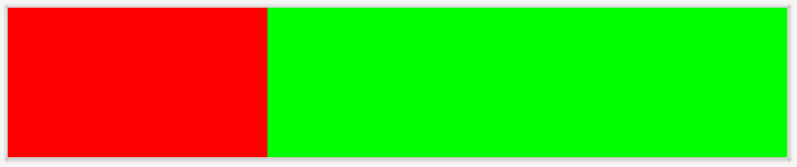
Example:

In ConstraintLayout, this is done as follows:

<?xml version="1.0" encoding="utf-8"?>
<androidx.constraintlayout.widget.ConstraintLayout 
    xmlns:android="http://schemas.android.com/apk/res/android"
    android:layout_width="match_parent"
    android:layout_height="match_parent"
    xmlns:app="http://schemas.android.com/apk/res-auto">
    <View
        android:layout_width="0dp"
        android:layout_height="100dp"
        android:id="@+id/red"
        android:background="@color/red"
        app:layout_constraintStart_toStartOf="parent"
        app:layout_constraintEnd_toStartOf="@+id/blue"
        app:layout_constraintHorizontal_weight="1"/>
    <View
        android:layout_width="0dp"
        android:layout_height="100dp"
        android:id="@+id/blue"
        android:background="@color/blue"
        app:layout_constraintStart_toEndOf="@id/red"
        app:layout_constraintEnd_toEndOf="parent"
        app:layout_constraintHorizontal_weight="2"/>
</androidx.constraintlayout.widget.ConstraintLayout>

In LinearLayouts, this is done as follows:

<?xml version="1.0" encoding="utf-8"?>
<LinearLayout xmlns:android="http://schemas.android.com/apk/res/android"
    android:layout_width="match_parent"
    android:layout_height="match_parent"
    android:orientation="horizontal">
    <View
        android:layout_width="0dp"
        android:layout_height="100dp"
        android:id="@+id/red"
        android:background="@color/red"
        android:layout_weight="1"/>
    <View
        android:layout_width="0dp"
        android:layout_height="100dp"
        android:id="@+id/blue"
        android:background="@color/blue"
        android:layout_weight="2"/>
</LinearLayout>

I know that you can use Tables to get evenly distributed things, but I want an uneven distribution.

7

There are 7 answers

2
Gabriele Mariotti On

You can use the Modifier.weight
Something like:

Row() {
    Column(
        Modifier.weight(1f).background(Blue)
    ){
        Text(text = "Weight = 1", color = Color.White)
    }
    Column(
        Modifier.weight(2f).background(Yellow)
    ) {
        Text(text = "Weight = 2")
    }
}

enter image description here

0
Richard Onslow Roper On

Use Modifier.weight(float) on the objects inside a container. You could also use constraintlayout or the Low Level Layout Composable. Check out the official compose layout codelab in compose pathways for more info on the same

0
Devrath On

Here is an example from my project on using weights

Composables

@Composable
fun PokemonAttributes(
    pokemonWeight: Int,
    pokemonHeight: Int,
    sectionHeight: Dp = 80.dp
) {
    val weight = remember { weightHeightMeasurement(pokemonWeight) }
    val height = remember { weightHeightMeasurement(pokemonHeight) }

    Row(
        modifier = Modifier.fillMaxWidth()
    ) {
        PokemonDetailDataItem(
            dataValue = weight,
            dataTag = stringResource(id = R.string.str_weight),
            dataUnit = stringResource(id = R.string.str_kg),
            dataIcon = painterResource(id = R.drawable.ic_pokemon_weight),
            modifier = Modifier.weight(1f)
        )
        Spacer(modifier = Modifier
            .size(1.dp, sectionHeight)
            .background(Color.LightGray))
        PokemonDetailDataItem(
            dataValue = height,
            dataTag = stringResource(id = R.string.str_height),
            dataUnit = stringResource(id = R.string.str_meter),
            dataIcon = painterResource(id = R.drawable.ic_pokemon_height),
            modifier = Modifier.weight(1f)
        )
    }
}

@Composable
fun PokemonDetailDataItem(
    dataValue: String,
    dataTag: String,
    dataUnit: String,
    dataIcon: Painter,
    modifier: Modifier = Modifier
) {

    val iconSize : Dp = 50.dp
    val attributeSpacing : Dp = 8.dp
    val attributeValueSize = 18.sp
    val attributeTagSize = 12.sp
    val displayText = "$dataValue $dataUnit"

    Row(
        verticalAlignment = Alignment.CenterVertically,
        horizontalArrangement = Arrangement.Center,
        modifier = modifier
    ) {
        Icon(
            painter = dataIcon,
            contentDescription = null,
            modifier = Modifier.size(iconSize),
            tint = MaterialTheme.colors.onSurface
        )
        Spacer(modifier = Modifier.width(10.dp))
        Column(
            horizontalAlignment = Alignment.CenterHorizontally,
            verticalArrangement = Arrangement.Center
        ) {
            Text(
                text = displayText,
                fontFamily = Nunito,
                fontWeight = FontWeight.Bold,
                fontSize = attributeValueSize,
                color = MaterialTheme.colors.onSurface
            )
            Text(
                text = dataTag,
                fontFamily = Nunito,
                fontWeight = FontWeight.Normal,
                fontSize = attributeTagSize,
                color = Color.LightGray
            )
        }

    }
}

Output

enter image description here

0
AudioBubble On

The "0.1.0-dev04" release of Jetpack Compose contains changes, and FlexRow is deprecated. I can propose the following solution:

Row {
    Card(modifier = LayoutFlexible(1f), color = Color.Red) {
        Container(expanded = true, height = 50.dp) {

        }
    }
    Card(modifier = LayoutFlexible(2f), color = Color.Green) {
        Container(expanded = true, height = 50.dp) {

        }
    }
}

Result: enter image description here

The LayoutFlexible(flex = _f) helps us to solve the issue and Modifier can be applied to any container.

2
markcadag On

Since "0.1.0-dev09" modifiers are moved on an interface, you can use

Modifier.weight(float, boolean)

to divide the vertical/horizontal space remaining after measuring unweighted child elements and distribute it according to this weight

 Column {
        Row(modifier = Modifier.weight(2.0f, true)) {
            Box (
                modifier = Modifier.fillMaxWidth().fillMaxHeight(),
                backgroundColor = Color.Red
            )
        }
        Row(modifier = Modifier.weight(1.0f, true)) {
            Box (
                modifier = Modifier.fillMaxWidth().fillMaxHeight(),
                backgroundColor = Color.Blue,
                gravity = ContentGravity.Center
            ) {
                Text(text = "A sample text")
            }
        }
        Row(modifier = Modifier.weight(2.0f, true)) {
            Box (
                modifier = Modifier.fillMaxWidth().fillMaxHeight(),
                backgroundColor = Color.Yellow
            )
        }
    }
0
Parmit Singh Malik On
Row() {
    OutlinedTextField(
        modifier = modifier.weight(1f).clickable {

        },
        value = formatDate(date) ?: "",
        onValueChange = {  },
        label = { Text("Date") },
        singleLine = true,
        readOnly = true
    )

    Spacer(modifier = Modifier.padding(4.dp))

    OutlinedTextField(
        modifier = modifier.weight(1f),
        value = formatTime(date) ?: "",
        onValueChange = {  },
        label = { Text("Time") },
        singleLine = true
    )
}
0
AudioBubble On

Compose transforms the state into UI elements.

Composition of elements Layout of elements Drawing of elements

Standard layout components

@Composable
fun ArtistCard() {
    Column {
        Text("Alfred Sisley")
        Text("3 minutes ago")
    }
}

Similarly, use Row to place items horizontally on the screen. Both Column and Row support configuring the alignment of the elements they contain.

  @Composable
    fun ArtistCard(artist: Artist) {
        Row(verticalAlignment = Alignment.CenterVertically) {
            Image(/*...*/)
            Column {
                Text(artist.name)
                Text(artist.lastSeenOnline)
            }
        }
    }

Use Box to put elements on top of another. Box also supports configuring specific alignment of the elements it contains.

@Composable
fun ArtistAvatar(artist: Artist) {
    Box {
        Image(/*...*/)
        Icon(/*...*/)
    }
}