I'm working on a project and noticed that bootstrap 4.0.0 beta does not use glyphicons anymore, so how could I achieve the same effect as the 2nd example "Using feedback icons" shown in the link here JQuery-validation and Bootstrap using font-awesome 4.7.0? I've included the output of the validation below for better clarity:
Currently this is what I've got:
HTML
<div class="form-group">
<label class="col-sm-4 control-label df-label" for="first_name">* First name:</label>
<div class="col-sm-5">
<input type="text" class="form-control" id="first_name" name="first_name" placeholder="First Name" />
</div>
</div>
<div class="form-group">
<label class="col-sm-5 control-label df-label" for="last_name">* Last name:</label>
<div class="col-sm-5">
<input type="text" class="form-control" id="last_name" name="last_name" placeholder="Last Name" />
</div>
</div>
....
<div class="form-group">
<div class="col-sm-12">
<button type="submit" class="btn btn-outline-success my-2 my-sm-0" id="send" name="send" value="Send">Send</button>
</div>
</div>
CSS
.has-danger .control-label,
.has-danger .help-block,
.has-danger .form-control-feedback {
    color: #d9534f;
}
jQuery
$( "#contact-form" ).validate({
    rules: {
        first_name: "required"
        ,last_name: "required"
        ,email: {
            required: true
            ,email: true
        }
        ,message: {
            required: true
            ,minlength: 10
        }
    }
    ,messages: {
        first_name: "Please enter your First name"
        ,last_name: "Please enter your Last name"
        ,email: "Please enter a valid Email address"
        ,message: {
            required: "Please enter a Message"
            ,minlength: "Your message must consist of at least 10 characters"
        }
    }
    ,meta: "validate"
    ,errorElement: "em",

    errorPlacement: function ( error, element ) {
        // Add the `help-block` class to the error element
        error.addClass( "help-block" );

        // Add `has-feedback` class to the parent div.form-group
        // in order to add icons to inputs
        element.parents( ".col-sm-5" ).addClass( "has-feedback" );
        element.parents( ".col-sm-8" ).addClass( "has-feedback" );

        if ( element.prop( "type" ) === "checkbox" ) {
            error.insertAfter( element.parent( "label" ) );
        } else {
            error.insertAfter( element );
        }

        // Add the span element, if doesn't exists, and apply the icon classes to it.
        if ( !element.next( "span" )[ 0 ] ) {
            $( "<span class='fa fa-times form-control-feedback'></span>" ).insertAfter( element );
        }
    },
    success: function ( label, element ) {
        // Add the span element, if doesn't exists, and apply the icon classes to it.
        if ( !$( element ).next( "span" )[ 0 ] ) {
            $( "<span class='fa fa-check form-control-feedback'></span>" ).insertAfter( $( element ) );
        }
    },
    highlight: function ( element, errorClass, validClass ) {
        $( element ).parents( ".col-sm-5" ).addClass( "has-danger" ).removeClass( "has-success" );
        $( element ).parents( ".col-sm-8" ).addClass( "has-danger" ).removeClass( "has-success" );
        $( element ).next( "span" ).addClass( "fa-times" ).removeClass( "fa-check" );
    },
    unhighlight: function ( element, errorClass, validClass ) {
        $( element ).parents( ".col-sm-5" ).addClass( "has-success" ).removeClass( "has-danger" );
        $( element ).parents( ".col-sm-8" ).addClass( "has-success" ).removeClass( "has-danger" );
        $( element ).next( "span" ).addClass( "fa-check" ).removeClass( "fa-times" );
    }
});
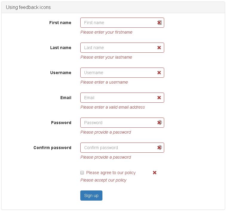
And here is my output so far:


I'm guessing your issue is first the placement of the feedback icon and second the color of the elements? There were some big changes between the alpha and beta versions of bootstrap (and also bootstrap 3), esp. in regards to form validation.
First, to place the icons correctly you'll need to add styling which equates to what was in bootstrap 3 and no longer in bootstrap 4 beta...here's what I'm using
The classes have changed as the beta uses the 'state' of the control which your posted code doesn't reflect, so your above code may not work. Anyway, you'll need to add 'was-validated' class to the form either in the success or highlight/unhighlight callbacks
I would also recommend using the new element and classes for form control help text