Text-overflow: ellipsis causes flex item to overflow flex container

4.5k views Asked by At

I have two columns inside a flex container. One of the columns (orange one) contains an avatar and its width should be exactly 10% of container.

Another column (blue one) contains panel, and the panel's title could be very long, so I should truncate it via css. This picture shows what I expect:

What I expect:

What I expect

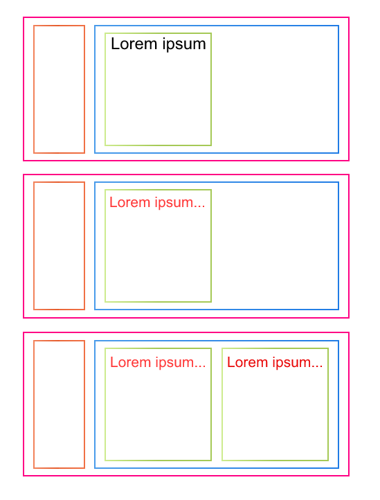
But when I'm trying to do text-overflow: ellipsis, my second row is becoming wider than the flex container. Here is example of this behaviour:

https://jsfiddle.net/8krtL9ev/1/

.container {
  background: #ddd;
  width: 400px;
  height: 200px;
  padding: 10px;
  display: flex;
}

.row1 {
  background: red;
  flex-basis: 10%;
  flex-shrink: 0;
}

.row2 {
  background: blue;
  flex-basis: 90%;
  margin-left: 10px;
  padding: 10px;
  display: flex;
}

.panel {
  background: green;
  flex-basis: 50%;
  overflow: hidden;
}

.panel-title {
  overflow: hidden;
  text-overflow: ellipsis;
  white-space: nowrap;
}
<div class="container">

  <div class="row1">
  </div>

  <div class="row2">
    <div class="panel">
      <div class="panel-title">
        <span>Lorem ipsum. Lorem ipsum. Lorem ipsum. Lorem ipsum. Lorem ipsum. Lorem ipsum. Lorem ipsum.</span>
      </div>
    </div>
  </div>
</div>

How can I solve this problem?

1

There are 1 answers

2
jafarbtech On BEST ANSWER

Use width in place of flex-basis. Because in this Documentation they have mentioned

9.9.3. Flex Item Intrinsic Size Contributions

The main-size min-content/max-content contribution of a flex item is its outer min-content/max-content size, clamped by its flex base size as a maximum (if it is not growable) and/or as a minimum (if it is not shrinkable), and then further clamped by its min/max main size properties.

Don't forget to set width calc(90% - 30px) as row2 width

.container {
  background: #ddd;
  width: 400px;
  height: 200px;
  padding: 10px;
  display: flex;
}

.row1 {
    background: red;
    /* flex-basis: 10%; */
    width: 10%;
    flex-shrink: 0;
}

.row2 {
    background: blue;
    /* flex-basis: 90%; */
    width: calc(90% - 30px);
    margin-left: 10px;
    padding: 10px;
    display: flex;
}

.panel {
  background: green;
  flex-basis: 50%;
  overflow: hidden;
}

.panel-title {
  overflow: hidden;
  text-overflow: ellipsis;
  white-space: nowrap;
}
<div class="container">

  <div class="row1">
  </div>

  <div class="row2">
    <div class="panel">
      <div class="panel-title">
        <span>Lorem ipsum. Lorem ipsum. Lorem ipsum. Lorem ipsum. Lorem ipsum. Lorem ipsum. Lorem ipsum.</span>
      </div>
    </div>
  </div>
</div>