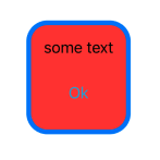
SwiftUI view with rounded corners AND border

51.2k views Asked by At
            ZStack {
                VStack {
                    Text("some text")
                    Button("Ok") {}
                     .foregroundColor(.cyan)
                     .padding()
                }
                .padding()
            }
            .background(.red)
            .border(.blue, width: 5)
            .cornerRadius(20)

enter image description here

I want the entire view to have the blue border with rounded corners (instead of the red square overlapping the rounded blue border. How? I've tried seemingly all variations of ordering the modifiers.

5

There are 5 answers

2
aheze On BEST ANSWER

SwiftUI borders have straight edges no matter what corner radius you apply (.cornerRadius simply clips the view to a rounded mask and doesn't adjust the border's appearance).

If you want a rounded border, you'll need to overlay and .stroke a rounded rectangle:

VStack {
    Text("some text")
    Button("Ok") {}
        .foregroundColor(.cyan)
        .padding()
}
.padding()
.background(.red)
.cornerRadius(20) /// make the background rounded
.overlay( /// apply a rounded border
    RoundedRectangle(cornerRadius: 20)
        .stroke(.blue, lineWidth: 5)
)

Result:

Rounded blue border

2
Levan Apakidze On

sometimes just adding the overlay may produce unsatisfying results (this is the case when the used view is designed with infinite width/height)

for example

so I'd recommend using an inset when trying to add rounded border

.overlay(
    RoundedRectangle(cornerRadius: 20)
        .inset(by: 5) // inset value should be same as lineWidth in .stroke
        .stroke(.blue, lineWidth: 5)
)
0
Pratik Panchal On
struct RoundedCorner: Shape {
    var radius: CGFloat = .infinity
    var corners: UIRectCorner = .allCorners
    
    func path(in rect: CGRect) -> Path {
        let path = UIBezierPath(roundedRect: rect, byRoundingCorners: corners, cornerRadii: CGSize(width: radius, height: radius))
        return Path(path.cgPath)
    }
}

extension View {
    func roundedCornerWithBorder(lineWidth: CGFloat, borderColor: Color, radius: CGFloat, corners: UIRectCorner) -> some View {
        clipShape(RoundedCorner(radius: radius, corners: corners) )
            .overlay(RoundedCorner(radius: radius, corners: corners)
                .stroke(borderColor, lineWidth: lineWidth))
    }
}

How to use different examples.

Example: 1 - Using All Side Corner Radius with Border.

  var body: some View {
        Text("Some Text")
            .padding()
            .background(.red)
            .roundedCornerWithBorder(lineWidth: 2, borderColor: .blue, radius: 4, corners: [.allCorners])        
    }

enter image description here

Example: 2 - For Top Left & Bottom Left Side Corner Radius with Border.

var body: some View {
    Text("Some Text")
        .padding()
        .background(.red)
        .roundedCornerWithBorder(lineWidth: 2, borderColor: .blue, radius: 20, corners: [.topLeft, .bottomLeft])
}

enter image description here

Example: 3 - For Top Right & Bottom Right Side Corner Radius with Border.

var body: some View {
    Text("Some Text")
        .padding()
        .background(.red)
        .roundedCornerWithBorder(lineWidth: 2, borderColor: .blue, radius: 20, corners: [.topRight, .bottomRight])
}

enter image description here

Example: 4 - For Top Left & Bottom Right Side Corner Radius with Border.

var body: some View {
    Text("Some Text")
        .padding()
        .background(.red)
        .roundedCornerWithBorder(lineWidth: 2, borderColor: .blue, radius: 20, corners: [.topLeft, .bottomRight])
}

enter image description here

0
Radu Ursache On

Adding over the other answers, here is a neat extension for your SwiftUI app:

fileprivate struct ModifierCornerRadiusWithBorder: ViewModifier {
    var radius: CGFloat
    var borderLineWidth: CGFloat = 1
    var borderColor: Color = .gray
    var antialiased: Bool = true
    
    func body(content: Content) -> some View {
        content
            .cornerRadius(self.radius, antialiased: self.antialiased)
            .overlay(
                RoundedRectangle(cornerRadius: self.radius)
                    .inset(by: self.borderLineWidth)
                    .strokeBorder(self.borderColor, lineWidth: self.borderLineWidth, antialiased: self.antialiased)
            )
    }
}

extension View {
    func cornerRadiusWithBorder(radius: CGFloat, borderLineWidth: CGFloat = 1, borderColor: Color = .gray, antialiased: Bool = true) -> some View {
        modifier(ModifierCornerRadiusWithBorder(radius: radius, borderLineWidth: borderLineWidth, borderColor: borderColor, antialiased: antialiased))
    }
}

You can then just do

VStack {
    Text("some text")
    Button("Ok") {}
        .foregroundColor(.cyan)
        .padding()
}
.padding()
.background(.red)
.cornerRadiusWithBorder(radius: 20, borderLineWidth: 5, borderColor: . blue)

to achieve this

enter image description here

0
Cem Kazım On

Using ".stroke" might be considered a best practice approach. However, if you'd like to try, the following method could also suffice:

RoundedRectangle(cornerRadius: 20)
    .foregroundColor(.blue)
    .frame(width: 100, height: 100)
    .overlay(
        RoundedRectangle(cornerRadius: 20)
            .foregroundColor(.red)
            .frame(width: 90, height: 90)
            .overlay(
                VStack {
                    Text("some text")
                    Button("Ok") {}
                }
            )
    )

You will get the same result with this.