I am trying to rewrite my project UI using Jetpack compose. Any idea to add popup menu using jetpack compose in android?. like this one below.

I tried to implement it using Stack() layout but the results are not up to the mark.
@Composable
fun LiveDataComponentList(productList: List<Product>) {
    AdapterList(data = productList) { product ->
        Stack() {
            Clickable(onClick = { PopupState.toggleOwner(product) }) {
                Card(...) {...}

            if (PopupState.owner == product) {
                Surface(color = Color.Gray,modifier = Modifier.gravity(Alignment.TopEnd) + Modifier.padding(12.dp)) {
                    Column() {
                        Text("menu 1")
                        Text("menu 2")
                        Text("menu 3")
                        Text("menu 4")
                        Text("menu 5")
                    }
                }
            }
        }
    }
}
and PopupState is
@Model
object PopupState
{
    var owner:Product?=null
    fun toggleOwner(item:Product)
    {
        if(owner==item)
            owner=null
        else
            owner=item
    }
}
result is

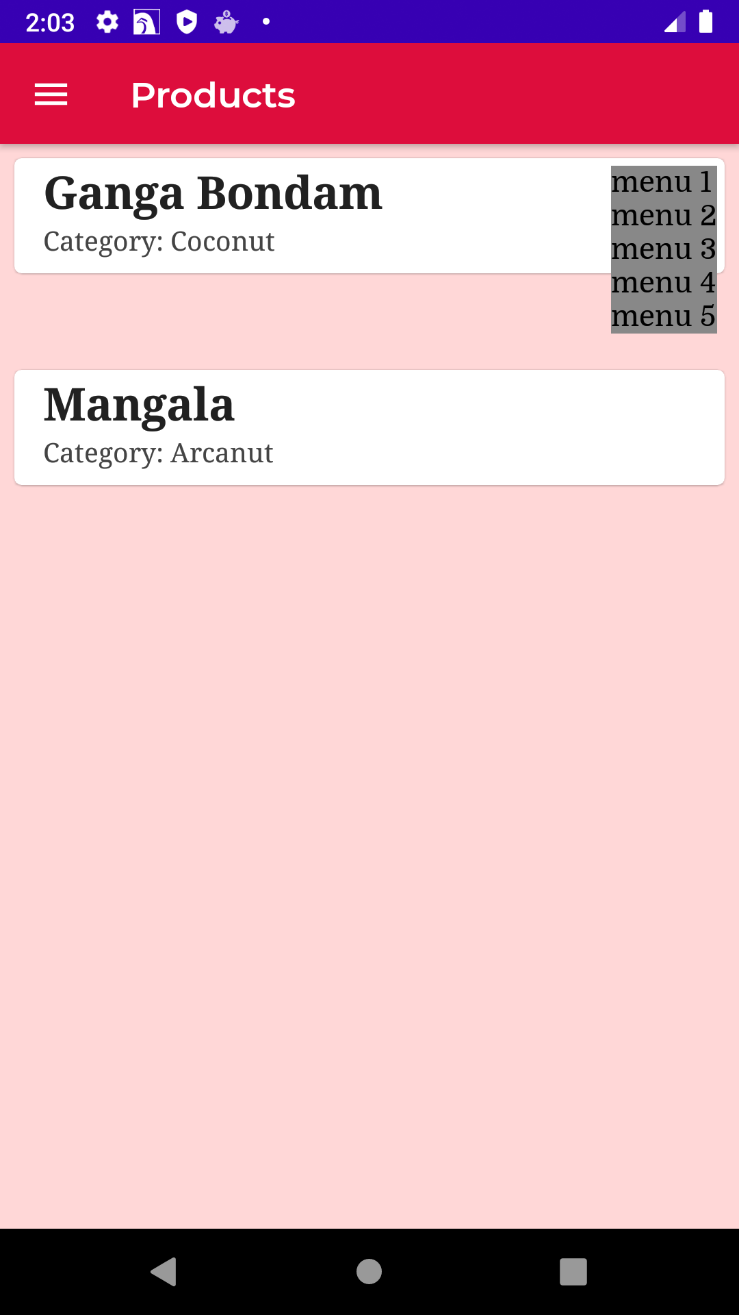
You can use the
DropdownMenu.Something like:
It works with M3. With M2 you have to use:
About the position, as explained in the documentation:
Example: