How to align title at layout center in TopAppBar?

23.1k views Asked by At
TopAppBar(
       backgroundColor = Color.Transparent,
       elevation = 0.dp,
       modifier= Modifier.fillMaxWidth(),
       navigationIcon = {
               IconButton(
                   onClick = { TODO },
                   enabled = true,
               ) {
                   Icon(
                       painter = painterResource(id = R.drawable.icon_back_arrow),
                       contentDescription = "Back",
                   )
               }
           }
       },
       title = {
           Text(
               modifier = if (action == null) Modifier.fillMaxWidth() else Modifier,
               textAlign = if (action == null) TextAlign.Center else TextAlign.Start,
               maxLines = 1,
               text = "Hello"
           )
       },
       actions = {
           action?.run {
               Text(
                   modifier = Modifier
                       .padding(horizontal = 16.dp)
                       .clickable(onClick = TODO),
                   color = Color.Green,
                   text ="Cancel",
               )
           }
       } 

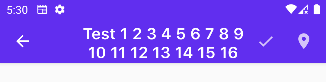
I'm new in jetpack and want to align title of TopAppBar at center if action is null. Title is not align center of layout. when there is no navigationIcon it work but adding navigationIcon it show slightly right. How can I do it to make title text at center of layout.

11

There are 11 answers

6
Gabriele Mariotti On BEST ANSWER

With Material3 you can simply use the CenterAlignedTopAppBar:

CenterAlignedTopAppBar(
    title = { Text("Centered TopAppBar") },
    navigationIcon = {
        IconButton(onClick = { /* doSomething() */ }) {
            Icon(
                imageVector = Icons.Filled.Menu,
                contentDescription = "Localized description"
            )
        }
    }
)

enter image description here


With Material2 you have to use the other constructor of TopAppBar that has no pre-defined slots for content, allowing you to customize the layout of content inside.

You can do something like:

val appBarHorizontalPadding = 4.dp
val titleIconModifier = Modifier.fillMaxHeight()
    .width(72.dp - appBarHorizontalPadding)

TopAppBar(
    backgroundColor = Color.Transparent,
    elevation = 0.dp,
    modifier= Modifier.fillMaxWidth()) {

    //TopAppBar Content
    Box(Modifier.height(32.dp)) {

        //Navigation Icon 
        Row(titleIconModifier, verticalAlignment = Alignment.CenterVertically) {                
            CompositionLocalProvider(
                LocalContentAlpha provides ContentAlpha.high,
            ) {
                IconButton(
                    onClick = { },
                    enabled = true,
                ) {
                    Icon(
                        painter = painterResource(id = R.drawable.ic_add_24px),
                        contentDescription = "Back",
                    )
                }
            }
        }

        //Title
        Row(Modifier.fillMaxSize(),
            verticalAlignment = Alignment.CenterVertically) {

            ProvideTextStyle(value = MaterialTheme.typography.h6) {
                CompositionLocalProvider(
                    LocalContentAlpha provides ContentAlpha.high,
                ){
                    Text(
                        modifier = Modifier.fillMaxWidth(),
                        textAlign = TextAlign.Center,
                        maxLines = 1,
                        text = "Hello"
                    )
                }
            }
        }

        //actions
        CompositionLocalProvider(LocalContentAlpha provides ContentAlpha.medium) {
            Row(
                Modifier.fillMaxHeight(),
                horizontalArrangement = Arrangement.End,
                verticalAlignment = Alignment.CenterVertically,
                content = actions
            )
        }
    }
}

enter image description here

0
Kajetan On

I'm just a begginer with Jetpack Compose and before I searched for a solution of that problem I tried to figure my own, maybe it will be enough for someone. I needed centered title for TopAppBar with navigation icon on the left side only or with two icons on the left and right side, this solution was OK for me. Later I configurated that for including passed icon on the right side or no.

        TopAppBar(
            backgroundColor = Color.Green,
            elevation = 5.dp,
        ) {
            Row(
                modifier = Modifier.fillMaxWidth(),
                horizontalArrangement = Arrangement.SpaceBetween,
                verticalAlignment = Alignment.CenterVertically
            ) {
                // size of an icon and placeholder box on the right side
                val iconSize = 32.dp

                Icon(
                    imageVector = Icons.Default.ArrowBack,
                    contentDescription = "Arrow Back",
                    modifier = Modifier
                        .clickable {
                            navController.popBackStack()
                        }
                        .size(iconSize)
                )
                Text(text = "Centered Title", fontSize = 32.sp)
                // placeholder on the right side in order to have centered title - might be replaced with icon
                Box(
                    modifier = Modifier
                        .size(iconSize)
                ) { }
            }

I can't attach screenshot, preview is here: https://i.stack.imgur.com/UNQTF.png

1
Veera Pusuluri On

Use fillMaxWidth() to let the Text View occupy AppBar width Use wrapContentWidth(align = Alignment.CenterHorizontally) to align the Text Title.

TopAppBar(
        title = {
            Text(
                text = screenname,
                modifier = Modifier
                    .fillMaxWidth()
                    .wrapContentWidth(align= Alignment.CenterHorizontally)
            )
        },
        modifier = modifier
    )
0
ssindher11 On

If you're using Material3, you can use the CenterAlignedTopAppBar as well.

fun CenterAlignedTopAppBar(
    title: @Composable () -> Unit,
    modifier: Modifier = Modifier,
    navigationIcon: @Composable () -> Unit = {},
    actions: @Composable RowScope.() -> Unit = {},
    colors: TopAppBarColors = TopAppBarDefaults.centerAlignedTopAppBarColors(),
    scrollBehavior: TopAppBarScrollBehavior? = null
) {
    SingleRowTopAppBar(
        modifier = modifier,
        title = title,
        titleTextStyle =
        MaterialTheme.typography.fromToken(TopAppBarSmallTokens.HeadlineFont),
        centeredTitle = true,
        navigationIcon = navigationIcon,
        actions = actions,
        colors = colors,
        scrollBehavior = scrollBehavior
    )
}

Center-aligned top app bar image

0
gaohomway On

The core of the title centering is that the space of the left and right occupying slots is the same. You only need to adjust the default size of the slots. We give the left and right slots the default space occupying slots, which can solve this problem well, and the code is simple.

@Composable
fun TopBar(title: Int, actions: @Composable (() -> Unit)? = null, popOnClick: () -> Unit) {

    val modifier = Modifier.size(width = 70.dp, height = 50.dp).background(Color.Red)

    TopAppBar(
        title = {
            Text(text = stringResource(id = title), fontSize = 16.sp,
             textAlign = TextAlign.Center, modifier = Modifier.fillMaxWidth()) },
        navigationIcon = {
            Box(modifier = modifier, contentAlignment = Alignment.Center) {
                IconButton(onClick = { popOnClick() }) {
                    Icon(Icons.Filled.ArrowBack, contentDescription = "", tint = MaterialTheme.colors.primary)
                }
            }
        },
        actions = {
            Box(modifier = modifier, contentAlignment = Alignment.Center) {
                if (actions != null) {
                    actions()
                }
            }
        },
        backgroundColor = MaterialTheme.colors.surface,
        elevation = 1.dp
    )
}


enter image description here

3
Sergei S On

EDIT: the old answer is out of date, please use CenterAlignedTopAppBar

CenterAlignedTopAppBar(
    title = { Text(text = stringResource(id = titleRes)) },
    actions = {
        IconButton(onClick = onActionClick) {
            Icon(
                imageVector = actionIcon,
                contentDescription = actionIconContentDescription,
                tint = MaterialTheme.colorScheme.onSurface
            )
        }
    },
    colors = colors,
    modifier = modifier,
)

OLD ANSWER:

I redid the native implementation a bit.

Need to do just two things:

1.Add this file to your project. This is a slightly modified implementation of the TopAppBar class. https://gist.github.com/evansgelist/aadcd633e9b160f9f634c16e99ffe163

2.Replace in your code TopAppBar to CenterTopAppBar. And it's all!

  Scaffold(
        topBar = {
            CenterTopAppBar(
                title = {
                    Text(
                        textAlign = TextAlign.Center,
                        text = text,
                    )
                },

EDIT extension's code

val Number.toPx
    get() = TypedValue.applyDimension(
        TypedValue.COMPLEX_UNIT_DIP,
        this.toFloat(),
        Resources.getSystem().displayMetrics
    )

Result enter image description here

enter image description here

enter image description here

enter image description here

1
Andy Pua On
@Composable
fun TopAppBarCompose(){

    TopAppBar(
        title = {
            Box(modifier = Modifier.fillMaxWidth()) {
                Text(
                    text = "Hello",
                    fontSize = 30.sp,
                    modifier = Modifier.align(Alignment.Center)
                )
            }
        },
    )
}
3
Kevin Sun On

The previous solutions are too complex. It is actually quite simple:

title = {
    Text(
        text = "title",
        textAlign = TextAlign.Center,
        modifier = Modifier.fillMaxWidth()
    )
}
0
azimut On
title = {
        Row(
            modifier.fillMaxWidth(),
            horizontalArrangement = Arrangement.SpaceEvenly,
            verticalAlignment = Alignment.CenterVertically
        ) {
            Text(
                stringResource(R.string.app_title).uppercase(),
                style = MaterialTheme.typography.h1
            )
            Spacer(modifier.width(1.dp))
        }
    },
0
paul vickers On

It depends what's in the appbar.

If you only have the title, then you could do the following:

topBar = {
        TopAppBar(content = {
            Text(
                modifier = Modifier.fillMaxWidth(),
                text = "Title Text",
                textAlign = TextAlign.Center,
                style = MaterialTheme.typography.h6,
            )
        })
    },

If you have an icon either side you should be able to do the same, may have to adjust things if have two icons one side and one the other, then may want to use add a same sized icon to even things out and put enabled to false to it's not clickable and color to transparent so it's not seen, otherwise you could try and figure out the size and add padding end to the text, it seems you also need to add 16.dp padding to the transparent icon, as the navigation icon is given extra padding before the title but not between title and actions

Here's what I did for the arrowIcon and title

 topBar = {
        TopAppBar(
            navigationIcon = {
                IconButton(
                    onClick = {
                        navController.popBackStack()
                    }
                ) {
                    Icon(
                        imageVector = Icons.Default.ArrowBack,
                        contentDescription = "back arrow icon"
                    )
                }
            },
            title = {
                Text(
                    modifier = Modifier
                        .fillMaxWidth(),
                    text = "Basic Navigation",
                    textAlign = TextAlign.Center,
                )
            },
            actions = {
                IconButton(
                     modifier = Modifier
                        .padding(start = 16.dp),
                    enabled = false,
                    onClick = {}
                ) {
                    Icon(
                        imageVector = Icons.Default.ArrowBack,
                        contentDescription = "back arrow icon",
                        tint = Color.Transparent
                    )
                }
            }
        )
    }
0
saintmarina On

I found a good workaround if you're using Material 2. Create a Row, that contains:

  • Column with weight 1, containing an Icon
  • Column with weight 1, containing Header
  • Spacer with weight 1

The device's screen will automatically divide into 3 equal sections. Here is a code sample:

Scaffold(
        topBar = {
            TopAppBar(
                backgroundColor = Transparent,
                elevation = 0.dp,
                modifier = Modifier.fillMaxWidth()
            ) {
                /** TopAppBar Content */
                Row(
                    modifier = Modifier.height(51.dp).fillMaxWidth(),
                    verticalAlignment = Alignment.CenterVertically
                ) {
                    /** Icon*/
                    Column(modifier = Modifier.weight(1f).padding(start = 9.dp)) {
                        IconButton(
                            onClick = { /*TODO*/ },
                            modifier = Modifier
                                .width(22.dp)
                                .height(22.dp),
                            enabled = true,
                        ) {
                            Icon(
                                painter = painterResource(id = R.drawable.ic_baseline_arrow_back),
                                contentDescription = "Back",
                                tint = ThemeBlue
                            )
                        }
                    }
                    /** Header */
                    Column(modifier = Modifier.weight(1f)) {
                        Text(
                            modifier = Modifier.fillMaxWidth(),
                            style = MaterialTheme.typography.h1,
                            textAlign = TextAlign.Center,
                            maxLines = 1,
                            text = "Header",
                        )
                    }
                    /*TODO
                     * When the stable version of Material 3 comes out
                     * we should replace the whole TopAppBar with CenterAlignedTopAppBar.
                     * For now, this Spacer keeps the Header component in the center of the topBar
                     */
                    Spacer(modifier = Modifier.weight(1f))
                }

            }
        },
        content = {
            Divider(color = ThemeBlue, thickness = 0.5.dp)
        }
    )

Here is a screenshot of the result this code produces:

TopBar