How do I change md-input-container placeholder color using css in Angular Material? As screenshot below I have phone no. and password textfield. Phone no. textfield has Phone No. and password has Password placeholder name.
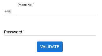
How do I change md-input-container placeholder color using css in Angular Material? As screenshot below I have phone no. and password textfield. Phone no. textfield has Phone No. and password has Password placeholder name.
 On
On
In Angular 4+
First you will need to turn ViewEncapsulation off to style Material Elements. Be warned this is subverting the Angular emulated-shadow DOM default and you should proceed with caution (https://blog.thoughtram.io/angular/2015/06/29/shadow-dom-strategies-in-angular2.html).
In dummy.component.ts:
@Component({
 ...,
 encapsulation: ViewEncapsulation.None,
})
Then give your < mat-form-field > element a unique class in dummy.component.html:
<mat-form-field class="dummy-input-field" floatPlaceholder="always">
  <input placeholder="Dummy"/>
</mat-form-field>
Finally in dummy.component.css apply the styling:
.dummy-input-field .mat-input-placeholder {
  color: red;
}
Similarly, if you'd like to dynamically change color if the field is focused:
.dummy-input-field.mat-focused .mat-input-placeholder {
  color: red;
}
For the newer versions of material which have a mat prefix instead of md prefix, you can do this in 2 ways:
way 1: using view encapsulation set to none and then writing the styles in the components css file, like @user2245995 pointed out in the answer above. Although this is the way angular suggests, please be advised that the styles you write here will propagate to all the child/parent components and effect other elements there.
way 2: We can use the shadow piercing descendant combinators i.e. /deep/ or ::ng-deep or >>> Below is an example
/deep/ label.mat-input-placeholder {
  color: #fff;   // choose the color you want
}
Although this method is specified in the angular docs as of now, they have mentioned that this method will soon be deprecated. read more: https://angular.io/guide/component-styles#!#-deep-
On
in the last version of angular you can remove the placeholder in the input and add a mat-placeholder in the mat-form-field and custom the css with a class
html :
<mat-form-field>
    <input matInput type="text">
    <mat-placeholder class="placeholder">Search</mat-placeholder>
</mat-form-field>
css:
.mat-focused .placeholder {
    color: #00D318;
}
.container {
  .mat-form-field-outline,
  .mat-form-field-empty.mat-form-field-label,
  .mat-form-field-label,
  .mat-form-field-underline,
  .mat-input-element,
  ::placeholder {
    color: $white !important;
  }
}
The code above gives me the results below. I am overriding the form-field outline, label-empty, label, underline, input element, placeholder text.
I'm using Angular 8.2.2 and Angular Material 8.2.2
On
I tried to be as deterministic as possible for the color of a mat input and I dare to share the result here, hoping it will help some others (the placeholder color customization need is handled, as asked in the question):
Note: The colors are considered different when the focus is here or not, that is why we have 2 blocs in the following:
    --clear-button-color: lightblue;
    --asterisk-color: lightgreen;
    --label-color: springgreen;
    --underline-color: blue;
    --input-color: lightgray;

    --clear-button-focused-color: blue;
    --asterisk-focused-color: green;
    --label-focused-color: pink;
    --underline-focused-color: yellow;
    --input-focused-color: gray;
    --placeholder-focused-color: magenta;
    --caret-focused-color: blue;
    .mat-form-field {
        &.mat-focused {
            > .mat-form-field-wrapper {
                > .mat-form-field-flex {
                    > .mat-form-field-infix {
                        > .mat-input-element {
                            color: var(--input-focused-color);
                            caret-color: var(--caret-focused-color);

                            &::placeholder {
                                color: var(--placeholder-focused-color);
                            }
                        }
                        > .mat-form-field-label-wrapper {
                            > .mat-form-field-label {
                                > mat-label {
                                    color: var(--label-focused-color);
                                }

                                > .mat-placeholder-required {
                                    color: var(--asterisk-focused-color);
                                }
                            }
                        }
                    }
                    > .mat-form-field-suffix {
                        > .mat-focus-indicator {
                            > .mat-button-wrapper {
                                > .mat-icon {
                                    color: var(--clear-button-focused-color);
                                }
                            }
                        }
                    }
                }
                > .mat-form-field-underline {
                    > .mat-form-field-ripple {
                        background-color: var(--underline-focused-color);
                    }

                    background-color: var(--underline-focused-color);
                }
            }
        }

        > .mat-form-field-wrapper {
            > .mat-form-field-flex {
                > .mat-form-field-infix {
                    > .mat-input-element {
                        color: var(--input-color);

                        &::placeholder {
                            color: var(--placeholder-color);
                        }
                    }
                    > .mat-form-field-label-wrapper {
                        > .mat-form-field-label {
                            > mat-label {
                                color: var(--label-color);
                            }

                            > .mat-placeholder-required {
                                color: var(--asterisk-color);
                            }
                        }
                    }
                }
                > .mat-form-field-suffix {
                    > .mat-focus-indicator {
                        > .mat-button-wrapper {
                            > .mat-icon {
                                color: var(--clear-button-color);
                            }
                        }
                    }
                }
            }
            > .mat-form-field-underline {
                > .mat-form-field-ripple {
                    background-color: var(--underline-color);
                }

                background-color: var(--underline-color);
            }
        }
    }
"@angular/material": "14.1.0",
in your styles.scss put.
// before focus
.mat-form-field-label {
  color: red
}

// after focus
.mat-input-element::placeholder{
   color: red;
}
it is not recommended to use ::ng-deep in a component. you can limit the effect by prefixing with an element ID like this. I used a wildcard here
    // before focus
     [id*="red"]
    .mat-input-element::placeholder{
       color: red;
    }

   // after focus
   [id*="red"]
    .mat-form-field-label {
      color: red
    }
Placeholder is depicted as a
<label>in Angular Material. So you actually need to style the label not the placeholder.As soon as you click (focus) on the input this
<label>which is looking as a placeholder slides up and converted into a form<label>.So you just need to apply this CSS:
Have a look at this Plunkr Demo.