How can I create an effect in the picture using angular/flex-layout. I've been experimenting with fxLayoutWrap but it doesn't produce the below layout
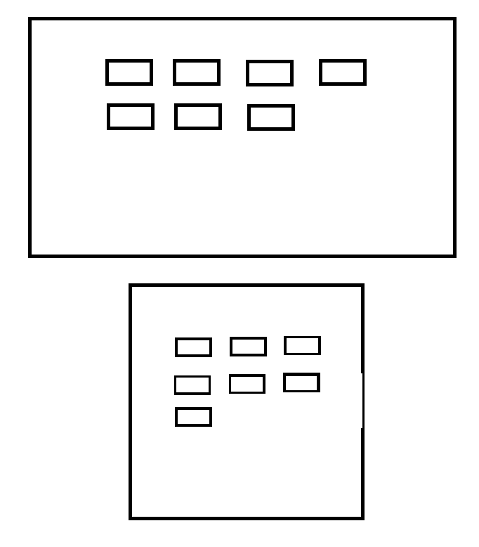
How can I warp and center multiple divs using Angular flex layout in a responsive way
1k views Asked by Toolkit At
2
There are 2 answers
0
 On
On
Here is a version for Angular 6 and flex-layout 6.0.0-beta.16, since fxLayoutWrap has been deprecated in this version
<div fxLayout="column" fxLayoutAlign=" none">
  <div fxFlex="100" fxLayout="row wrap" fxLayoutAlign="space-around stretch" fxLayout.xs="column">
    <div *ngFor="let item of items | async" fxFlex.xs="100" fxFlex.sm="50" fxFlex.md="33" fxFlex.lg="33" fxFlex.xl="33">
     {{item}}
    </div>
  </div>
</div>
The best way is to combine fxLayoutWrap with responsive fxFlex sizes for the elements. Setting fxLayoutGap="#" will also make sure there's a gap between row items. Setting a margin for the inner div's top/bottom can also handle the gap between rows (lots of times needed for Angular - Material items)
And if you haven't seen this live demo I'd highly recommend checking it out it's an amazingly great way to get a better understanding of how flex-layout works by watching the changes happen in real time.