I was wondering if there is a solution for Exposed drop-down menu for jetpack compose? I couldn't find a proper solution for this component inside jetpack compose. Any help?
I was wondering if there is a solution for Exposed drop-down menu for jetpack compose? I couldn't find a proper solution for this component inside jetpack compose. Any help?
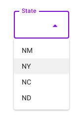
 On
On
This is what I did to get the width the same as the text field: Copying and modifying Gabriele's answer.
var expanded by remember { mutableStateOf(false) }
val suggestions = listOf("Item1","Item2","Item3")
var selectedText by remember { mutableStateOf("") }

var dropDownWidth by remember { mutableStateOf(0) }

val icon = if (expanded)
    Icons.Filled.....
else
    Icons.Filled.ArrowDropDown


Column() {
    OutlinedTextField(
        value = selectedText,
        onValueChange = { selectedText = it },
        modifier = Modifier.fillMaxWidth()
            .onSizeChanged {
                dropDownWidth = it.width
            },
        label = {Text("Label")},
        trailingIcon = {
            Icon(icon,"contentDescription", Modifier.clickable { expanded = !expanded })
        }
    )
    DropdownMenu(
        expanded = expanded,
        onDismissRequest = { expanded = false },
        modifier = Modifier
                .width(with(LocalDensity.current){dropDownWidth.toDp()})
    ) {
        suggestions.forEach { label ->
            DropdownMenuItem(onClick = {
                selectedText = label
            }) {
                Text(text = label)
            }
        }
    }
}
Here's my version.
I achieved this without using a TextField (so no keyboard).
There's a "regular" and an "outlined" version.
import androidx.compose.animation.core.animateFloatAsState
import androidx.compose.foundation.background
import androidx.compose.foundation.border
import androidx.compose.foundation.clickable
import androidx.compose.foundation.layout.*
import androidx.compose.foundation.shape.ZeroCornerSize
import androidx.compose.material.*
import androidx.compose.material.icons.Icons
import androidx.compose.material.icons.filled.ArrowDropDown
import androidx.compose.runtime.*
import androidx.compose.ui.Alignment
import androidx.compose.ui.Modifier
import androidx.compose.ui.draw.clip
import androidx.compose.ui.draw.drawBehind
import androidx.compose.ui.draw.rotate
import androidx.compose.ui.geometry.Offset
import androidx.compose.ui.geometry.Size
import androidx.compose.ui.graphics.Color
import androidx.compose.ui.graphics.Shape
import androidx.compose.ui.layout.onGloballyPositioned
import androidx.compose.ui.platform.LocalDensity
import androidx.compose.ui.platform.LocalFocusManager
import androidx.compose.ui.unit.Dp
import androidx.compose.ui.unit.dp
import androidx.compose.ui.unit.toSize
import kotlinx.coroutines.delay
import kotlinx.coroutines.launch


// ExposedDropDownMenu will be added in Jetpack Compose 1.1.0.
// This is a reimplementation while waiting.
// See https://stackoverflow.com/questions/67111020/exposed-drop-down-menu-for-jetpack-compose/6904285

@Composable
fun SimpleExposedDropDownMenu(
    values: List<String>,
    selectedIndex: Int,
    onChange: (Int) -> Unit,
    label: @Composable () -> Unit,
    modifier: Modifier = modifier,
    backgroundColor: Color = MaterialTheme.colors.onSurface.copy(alpha = TextFieldDefaults.BackgroundOpacity),
    shape: Shape = MaterialTheme.shapes.small.copy(bottomEnd = ZeroCornerSize, bottomStart = ZeroCornerSize)
) {
    SimpleExposedDropDownMenuImpl(
        values = values,
        selectedIndex = selectedIndex,
        onChange = onChange,
        label = label,
        modifier = modifier,
        backgroundColor = backgroundColor,
        shape = shape,
        decorator = { color, width, content ->
            Box(
                Modifier
                    .drawBehind {
                        val strokeWidth = width.value * density
                        val y = size.height - strokeWidth / 2
                        drawLine(
                            color,
                            Offset(0f, y),
                            Offset(size.width, y),
                            strokeWidth
                        )
                    }
            ) {
                content()
            }
        }
    )
}

@Composable
fun SimpleOutlinedExposedDropDownMenu(
    values: List<String>,
    selectedIndex: Int,
    onChange: (Int) -> Unit,
    label: @Composable () -> Unit,
    modifier: Modifier = modifier,
    backgroundColor: Color = MaterialTheme.colors.onSurface.copy(alpha = TextFieldDefaults.BackgroundOpacity),
    shape: Shape = MaterialTheme.shapes.small
) {
    SimpleExposedDropDownMenuImpl(
        values = values,
        selectedIndex = selectedIndex,
        onChange = onChange,
        label = label,
        modifier = modifier,
        backgroundColor = backgroundColor,
        shape = shape,
        decorator = { color, width, content ->
            Box(
                Modifier
                    .border(width, color, shape)
            ) {
                content()
            }
        }
    )
}

@Composable
private fun SimpleExposedDropDownMenuImpl(
    values: List<String>,
    selectedIndex: Int,
    onChange: (Int) -> Unit,
    label: @Composable () -> Unit,
    modifier: Modifier,
    backgroundColor: Color,
    shape: Shape,
    decorator: @Composable (Color, Dp, @Composable () -> Unit) -> Unit
) {
    var expanded by remember { mutableStateOf(false) }
    var textfieldSize by remember { mutableStateOf(Size.Zero) }

    val indicatorColor =
        if (expanded) MaterialTheme.colors.primary.copy(alpha = ContentAlpha.high)
        else MaterialTheme.colors.onSurface.copy(alpha = TextFieldDefaults.UnfocusedIndicatorLineOpacity)
    val indicatorWidth = (if (expanded) 2 else 1).dp
    val labelColor =
        if (expanded) MaterialTheme.colors.primary.copy(alpha = ContentAlpha.high)
        else MaterialTheme.colors.onSurface.copy(ContentAlpha.medium)
    val trailingIconColor = MaterialTheme.colors.onSurface.copy(alpha = TextFieldDefaults.IconOpacity)

    val rotation: Float by animateFloatAsState(if (expanded) 180f else 0f)

    val focusManager = LocalFocusManager.current

    Column(modifier = modifier.width(IntrinsicSize.Min)) {
        decorator(indicatorColor, indicatorWidth) {
            Box(
                Modifier
                    .fillMaxWidth()
                    .background(color = backgroundColor, shape = shape)
                    .onGloballyPositioned { textfieldSize = it.size.toSize() }
                    .clip(shape)
                    .clickable {
                        expanded = !expanded
                        focusManager.clearFocus()
                    }
                    .padding(start = 16.dp, end = 12.dp, top = 7.dp, bottom = 10.dp)
            ) {
                Column(Modifier.padding(end = 32.dp)) {
                    ProvideTextStyle(value = MaterialTheme.typography.caption.copy(color = labelColor)) {
                        label()
                    }
                    Text(
                        text = values[selectedIndex],
                        modifier = Modifier.padding(top = 1.dp)
                    )
                }
                Icon(
                    imageVector = Icons.Filled.ArrowDropDown,
                    contentDescription = "Change",
                    tint = trailingIconColor,
                    modifier = Modifier
                        .align(Alignment.CenterEnd)
                        .padding(top = 4.dp)
                        .rotate(rotation)
                )

            }
        }

        DropdownMenu(
            expanded = expanded,
            onDismissRequest = { expanded = false },
            modifier = Modifier
                .width(with(LocalDensity.current) { textfieldSize.width.toDp() })
        ) {
            values.forEachIndexed { i, v ->
                val scope = rememberCoroutineScope()
                DropdownMenuItem(
                    onClick = {
                        onChange(i)
                        scope.launch {
                            delay(150)
                            expanded = false
                        }
                    }
                ) {
                    Text(v)
                }
            }
        }
    }
}
In addition to what has been written here, I case could be useful to someone and for my personal memo note for next usages, I've realized this drop-down menu function component using BasicTextField for no decoration and no default padding, no arrow icon, with item selected text aligned to right (.End) , filling max text width (.fillMaxWidth()) with single line in list.
data class DropDownMenuParameter(
        var options: List<String>,
        var expanded: Boolean,
        var selectedOptionText: String,
        var backgroundColor: Color
    )


@ExperimentalMaterialApi
@Composable
fun DropDownMenuComponent(params: DropDownMenuParameter) {
    var expanded by remember { mutableStateOf(params.expanded) }


    ExposedDropdownMenuBox(
        expanded = expanded,
        onExpandedChange = {
            expanded = !expanded
        }
    ) {
        BasicTextField(
            modifier = Modifier
                .background(params.backgroundColor)
                .fillMaxWidth(),
            readOnly = true,
            value = params.selectedOptionText,
            onValueChange = { },
            textStyle = TextStyle(
                color = Color.White,
                textAlign = TextAlign.End,
                fontSize = 16.sp,
            ),
            singleLine = true

        )
        ExposedDropdownMenu(
            modifier = Modifier
                .background(params.backgroundColor),
            expanded = expanded,
            onDismissRequest = {
                expanded = false
            }
        ) {
            params.options.forEach { selectionOption ->
                DropdownMenuItem(
                    modifier = Modifier
                        .background(params.backgroundColor),
                    onClick = {
                        params.selectedOptionText = selectionOption
                        expanded = false
                    },

                    ) {
                    Text(
                        text = selectionOption,
                        color = Color.White,
                    )

                }
            }
        }
    }

}
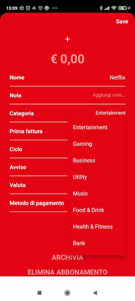
My usage :
@OptIn(ExperimentalAnimationApi::class, ExperimentalMaterialApi::class)
@Composable
fun SubscribeSubscriptionDetails(selectedSubscription : Subscription){


    val categoryOptions = listOf("Entertainment", "Gaming", "Business", "Utility", "Music", "Food & Drink", "Health & Fitness", "Bank", "Transport", "Education", "Insurance", "News")
    val categoryExpanded by rememberSaveable { mutableStateOf(false) }
val categorySelectedOptionText
        by rememberSaveable { mutableStateOf(selectedSubscription.category) }
val categoryDropDownMenuPar by remember {
    mutableStateOf(
        DropDownMenuParameter(
            options = categoryOptions,
            expanded = categoryExpanded,
            selectedOptionText = categorySelectedOptionText,
            backgroundColor = serviceColorDecoded
        )
    )
}

    // ....


    Row { // categoria

            Text(
                modifier = Modifier
                    .padding(textMargin_24, 0.dp, 0.dp, 0.dp)
                    .weight(0.5f),
                text = "Categoria",
                fontWeight = FontWeight.Bold,
                color = Color.White,
                textAlign = TextAlign.Left,
                fontSize = 16.sp,
                )


            Row(
                modifier = Modifier
                    .padding(0.dp, 0.dp, 24.dp, 0.dp)
                    .weight(0.5f),
                horizontalArrangement = Arrangement.End
            ){
                DropDownMenuComponent(categoryDropDownMenuPar)
            }


        }


    // .....


}
to retrieve the value after selection : categoryDropDownMenuPar.selectedOptionText
On
A few modifications to @Gabriele Mariotti answer A user can select an outline text field and select from an option. Option will be disappear once user select any option.
    @Composable
fun DropDownMenu(optionList: List<String>,label:String,) {
    var expanded by remember { mutableStateOf(false) }

    var selectedText by remember { mutableStateOf("") }

    var textfieldSize by remember { mutableStateOf(Size.Zero) }

    val icon = if (expanded)
        Icons.Filled.KeyboardArrowUp
    else
        Icons.Filled.KeyboardArrowDown


    Column() {
        OutlinedTextField(
            value = selectedText,
            onValueChange = { selectedText = it },
            enabled = false,
            modifier = Modifier
                .fillMaxWidth()
                .onGloballyPositioned { coordinates ->
                    //This value is used to assign to the DropDown the same width
                    textfieldSize = coordinates.size.toSize()
                }
                .clickable { expanded = !expanded },
            label = { Text(label) },
            trailingIcon = {
                Icon(icon, "Drop Down Icon",
                    Modifier.clickable { expanded = !expanded })
            }
        )
        DropdownMenu(
            expanded = expanded,
            onDismissRequest = { expanded = false },
            modifier = Modifier
                .width(with(LocalDensity.current) { textfieldSize.width.toDp() })
        ) {
            optionList.forEach { label ->
                DropdownMenuItem(onClick = {
                    selectedText = label
                    expanded = !expanded
                }) {
                    Text(text = label)
                }
            }
        }
    }
}
If you are using material3 and a newer version of compose (this is working for v1.3.1), the DropdownMenuItem has changed slightly. Text must now be a property (rather than an @Composable).
You will still need to opt in to the experimental api, @OptIn(ExperimentalMaterial3Api::class).
This example is in the androidx.compose.material3 documentation.
import androidx.compose.material3.DropdownMenuItem
import androidx.compose.material3.ExposedDropdownMenuBox
import androidx.compose.material3.Text
import androidx.compose.material3.TextField
import androidx.compose.runtime.mutableStateOf
import androidx.compose.runtime.remember

val options = listOf("Option 1", "Option 2", "Option 3", "Option 4", "Option 5")
var expanded by remember { mutableStateOf(false) }
var selectedOptionText by remember { mutableStateOf(options[0]) }
// We want to react on tap/press on TextField to show menu
ExposedDropdownMenuBox(
    expanded = expanded,
    onExpandedChange = { expanded = !expanded },
) {
    TextField(
        // The `menuAnchor` modifier must be passed to the text field for correctness.
        modifier = Modifier.menuAnchor(),
        readOnly = true,
        value = selectedOptionText,
        onValueChange = {},
        label = { Text("Label") },
        trailingIcon = { ExposedDropdownMenuDefaults.TrailingIcon(expanded = expanded) },
        colors = ExposedDropdownMenuDefaults.textFieldColors(),
    )
    ExposedDropdownMenu(
        expanded = expanded,
        onDismissRequest = { expanded = false },
    ) {
        options.forEach { selectionOption ->
            DropdownMenuItem(
                text = { Text(selectionOption) },
                onClick = {
                    selectedOptionText = selectionOption
                    expanded = false
                },
                contentPadding = ExposedDropdownMenuDefaults.ItemContentPadding,
            )
        }
    }
}
Doing this the 'old way', I had the following errors on the Text(text = selectionOption) line:
No value passed for parameter 'text'Type mismatch: inferred type is () -> Unit but MutableInteractionSource was expected@Composable invocations can only happen from the context of a @Composable function
On
The other answers are based on selecting strings. However, I needed the dropdown to select from a list of models and only allow a model to be selected. I also wanted the dropdown to show right away with all the options.
Here's a solution for selecting a model while allowing auto complete to search through the models. The solution also works for simple strings.
Usage
data class PreviewOption(val text: String, val id: Int)

val options = remember {
    listOf(
        PreviewOption("Option 1", 1),
        PreviewOption("Option 2", 2),
        PreviewOption("Option 3", 3),
        PreviewOption("Option 4", 4),
        PreviewOption("Option 5", 5),
    )
}

var selectedOption by remember { mutableStateOf<PreviewOption?>(null) }

TextFieldMenu(
    label = "Options",
    options = options,
    selectedOption = selectedOption,
    onOptionSelected = { selectedOption = it },
    optionToString = { it.text },
    filteredOptions = { searchInput ->
        options.filter { it.text.contains(searchInput, ignoreCase = true) }
    },
)

Full M3 Implementation: TextFieldMenu.kt
import androidx.compose.foundation.ExperimentalFoundationApi
import androidx.compose.foundation.layout.Arrangement
import androidx.compose.foundation.layout.Column
import androidx.compose.foundation.layout.fillMaxWidth
import androidx.compose.foundation.layout.imePadding
import androidx.compose.foundation.layout.padding
import androidx.compose.foundation.relocation.BringIntoViewRequester
import androidx.compose.foundation.relocation.bringIntoViewRequester
import androidx.compose.foundation.rememberScrollState
import androidx.compose.foundation.text.KeyboardActions
import androidx.compose.foundation.text.KeyboardOptions
import androidx.compose.foundation.verticalScroll
import androidx.compose.material3.DropdownMenuItem
import androidx.compose.material3.ExperimentalMaterial3Api
import androidx.compose.material3.ExposedDropdownMenuBox
import androidx.compose.material3.ExposedDropdownMenuDefaults
import androidx.compose.material3.MaterialTheme
import androidx.compose.material3.OutlinedTextField
import androidx.compose.material3.Text
import androidx.compose.material3.TextFieldColors
import androidx.compose.runtime.Composable
import androidx.compose.runtime.getValue
import androidx.compose.runtime.mutableStateOf
import androidx.compose.runtime.remember
import androidx.compose.runtime.rememberCoroutineScope
import androidx.compose.runtime.setValue
import androidx.compose.ui.ExperimentalComposeUiApi
import androidx.compose.ui.Modifier
import androidx.compose.ui.focus.FocusRequester
import androidx.compose.ui.focus.focusRequester
import androidx.compose.ui.focus.onFocusChanged
import androidx.compose.ui.graphics.Color
import androidx.compose.ui.platform.LocalFocusManager
import androidx.compose.ui.platform.LocalSoftwareKeyboardController
import androidx.compose.ui.text.font.FontStyle
import androidx.compose.ui.text.input.ImeAction
import androidx.compose.ui.text.style.TextOverflow
import androidx.compose.ui.tooling.preview.Preview
import androidx.compose.ui.unit.dp
import kotlinx.coroutines.CoroutineScope
import kotlinx.coroutines.launch

/** A text field that allows the user to type in to filter down options. */
@OptIn(ExperimentalFoundationApi::class, ExperimentalComposeUiApi::class,
    ExperimentalMaterial3Api::class
)
@Composable
fun <T> TextFieldMenu(
    modifier: Modifier = Modifier,
    /** The label for the text field */
    label: String,
    /** All the available options. */
    options: List<T>,
    /** The selected option. */
    selectedOption: T?,
    /** When the option is selected via tapping on the dropdown option or typing in the option. */
    onOptionSelected: (T?) -> Unit,
    /** Converts [T] to a string for populating the initial text field value. */
    optionToString: (T) -> String,
    /** Returns the filtered options based on the input. This where you need to implement your search. */
    filteredOptions: (searchInput: String) -> List<T>,
    /** Creates the row for the filtered down option in the menu. */
    optionToDropdownRow: @Composable (T) -> Unit = { option ->
        Text(optionToString(option))
    },
    /** Creates the view when [filteredOptions] returns a empty list. */
    noResultsRow: @Composable () -> Unit = {
        // By default, wrap in a menu item to get the same style
        DropdownMenuItem(
            onClick = {},
            text = {
                Text(
                    "No Matches Found",
                    style = MaterialTheme.typography.bodySmall,
                    color = MaterialTheme.colorScheme.secondary,
                    fontStyle = FontStyle.Italic,
                )
            },
        )
    },
    focusRequester: FocusRequester = remember { FocusRequester() },
    keyboardOptions: KeyboardOptions = KeyboardOptions.Default,
    trailingIcon: @Composable (expanded: Boolean) -> Unit = { expanded ->
        ExposedDropdownMenuDefaults.TrailingIcon(expanded = expanded)
    },
    textFieldColors: TextFieldColors = ExposedDropdownMenuDefaults.textFieldColors(
        containerColor = Color.Transparent,
    ),
    bringIntoViewRequester: BringIntoViewRequester = remember { BringIntoViewRequester() },
    coroutineScope: CoroutineScope = rememberCoroutineScope(),
) {
    // Get our text for the selected option
    val selectedOptionText = remember(selectedOption) {
        selectedOption?.let { optionToString(it) }.orEmpty()
    }

    // Default our text input to the selected option
    var textInput by remember(selectedOptionText) {
        mutableStateOf(selectedOptionText)
    }

    var dropDownExpanded by remember { mutableStateOf(false) }

    // Update our filtered options everytime our text input changes
    val filteredOptions = remember(textInput, dropDownExpanded) {
        when (dropDownExpanded) {
            true -> filteredOptions(textInput)
            // Skip filtering when we don't need to
            false -> emptyList()
        }
    }

    val keyboardController = LocalSoftwareKeyboardController.current
    val focusManager = LocalFocusManager.current

    ExposedDropdownMenuBox(
        expanded = dropDownExpanded,
        onExpandedChange = { dropDownExpanded = !dropDownExpanded },
        modifier = modifier,
    ) {
        // Text Input
        OutlinedTextField(
            value = textInput,
            onValueChange = {
                // Dropdown may auto hide for scrolling but it's important it always shows when a user
                // does a search
                dropDownExpanded = true
                textInput = it
            },
            modifier = Modifier
                // Match the parent width
                .fillMaxWidth()
                .bringIntoViewRequester(bringIntoViewRequester)
                .menuAnchor()
                .focusRequester(focusRequester)
                .onFocusChanged { focusState ->
                    // When only 1 option left when we lose focus, selected it.
                    if (!focusState.isFocused) {
                        // Whenever we lose focus, always hide the dropdown
                        dropDownExpanded = false

                        when (filteredOptions.size) {
                            // Auto select the single option
                            1 -> if (filteredOptions.first() != selectedOption) {
                                onOptionSelected(filteredOptions.first())
                            }
                            // Nothing to we can auto select - reset our text input to the selected value
                            else -> textInput = selectedOptionText
                        }
                    } else {
                        // When focused:
                        // Ensure field is visible by scrolling to it
                        coroutineScope.launch {
                            bringIntoViewRequester.bringIntoView()
                        }
                        // Show the dropdown right away
                        dropDownExpanded = true
                    }
                },
            label = { Text(label) },
            trailingIcon = { trailingIcon(dropDownExpanded) },
            colors = textFieldColors,
            keyboardOptions = keyboardOptions.copy(
                imeAction = when (filteredOptions.size) {
                    // We will either reset input or auto select the single option
                    0, 1 -> ImeAction.Done
                    // Keyboard will hide to make room for search results
                    else -> ImeAction.Search
                }
            ),
            keyboardActions = KeyboardActions(
                onAny = {
                    when (filteredOptions.size) {
                        // Remove focus to execute our onFocusChanged effect
                        0, 1 -> focusManager.clearFocus(force = true)
                        // Can't auto select option since we have a list, so hide keyboard to give more room for dropdown
                        else -> keyboardController?.hide()
                    }
                }
            )
        )

        // Dropdown
        if (dropDownExpanded) {
            val dropdownOptions = remember(textInput) {
                if (textInput.isEmpty()) {
                    // Show all options if nothing to filter yet
                    options
                } else {
                    filteredOptions(textInput)
                }
            }

            ExposedDropdownMenu(
                expanded = dropDownExpanded,
                onDismissRequest = { dropDownExpanded = false },
            ) {
                if (dropdownOptions.isEmpty()) {
                    noResultsRow()
                } else {
                    dropdownOptions.forEach { option ->
                        DropdownMenuItem(
                            onClick = {
                                dropDownExpanded = false
                                onOptionSelected(option)
                                focusManager.clearFocus(force = true)
                            },
                            text = {
                                optionToDropdownRow(option)
                            }
                        )
                    }
                }
            }
        }
    }
}

@OptIn(ExperimentalFoundationApi::class, ExperimentalMaterial3Api::class)
@Preview(showSystemUi = true)
@Composable
private fun PreviewTextFieldMenu() {
    data class PreviewOption(val text: String, val id: Int)

    var selectedOption by remember { mutableStateOf<PreviewOption?>(null) }
    val options = remember {
        listOf(
            PreviewOption("Option 1", 1),
            PreviewOption("Option 2", 2),
            PreviewOption("Option 3", 3),
            PreviewOption("Option 4", 4),
            PreviewOption("Option 5", 5),
        )
    }

    Column(
        modifier = Modifier
            // Reduce column height when keyboard is shown
            // Note: This needs to be set _before_ verticalScroll so that BringIntoViewRequester APIs work
            .imePadding()
            .verticalScroll(rememberScrollState())
            .padding(16.dp),
        verticalArrangement = Arrangement.spacedBy(12.dp)
    ) {

        val nameFocusRequester = remember { FocusRequester() }
        val optionsFocusRequester = remember { FocusRequester() }

        var nameInput by remember { mutableStateOf("") }

        // Free Style Input
        OutlinedTextField(
            modifier = Modifier
                .focusRequester(nameFocusRequester)
                .fillMaxWidth(),
            label = {
                Text(
                    text = "Name",
                    overflow = TextOverflow.Ellipsis,
                    maxLines = 1,
                )
            },
            value = nameInput,
            onValueChange = { nameInput = it },
            singleLine = true,
            keyboardOptions = KeyboardOptions(imeAction = ImeAction.Next),
            keyboardActions = KeyboardActions(
                onNext = { optionsFocusRequester.requestFocus() },
            ),
        )

        TextFieldMenu(
            modifier = Modifier.fillMaxWidth(),
            label = "Options",
            options = options,
            selectedOption = selectedOption,
            onOptionSelected = { selectedOption = it },
            optionToString = { it.text },
            filteredOptions = { searchInput ->
                options.filter { it.text.contains(searchInput, ignoreCase = true) }
            },
            focusRequester = optionsFocusRequester,
        )
    }
}
The M2 (starting from the version
1.1.0-alpha06) and M3 have the implementation ofExposedDropdownMenubased onExposedDropdownMenuBoxwithTextFieldandDropdownMenuinside.Something like:
If you are using M3 (
androidx.compose.material3) you have also to pass themenuAnchormodifier to theTextField:Also in M3 in the
DropdownMenuItemyou have to move the content in thetextparameter:With the M2 version
1.0.xthere isn't a built-in component.You can use a
OutlinedTextField+DropdownMenu. It is important to wrap the them in aBox. In this way the TextField will be used as the 'anchor'.It is just a basic (very basic) implementation: