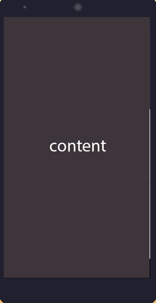
I am designing a single page which has a mobile phone Image (Android or IOS Phone). I want this image to be centered within the page on Desktop and Tablet. On Mobile Phone (The phone image), it should fit the whole screen. Also, l want to place with some html content on top of the image. No matter the screen size, the background phone image and the content must fit together.
This is what l have done so far
<html>

<head>
<style>
#con{
    background-image: url('example.png');
    background-size: contain;
    background-repeat: no-repeat;
    width: 100%;
    height: 0;
    padding-top: 66.64%;

}
</style>

</head>

<body>

<div style=" margin: 0 auto;">
  <div id="con"></div>
</div>

</body>

</html>

You can try using
@mediato do adaptation