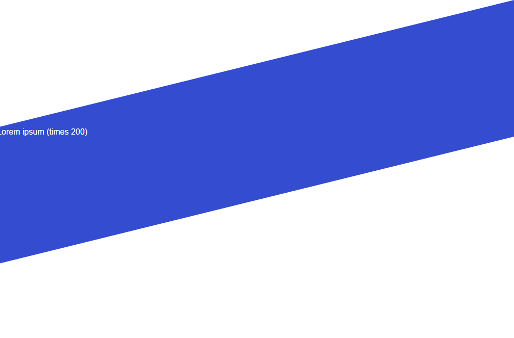
Desired result:
A CSS solution where I have a container with width: 100%;, and above and below the container, I have triangles attached that create a parallelogram. The triangles should cover the entire width of the screen.
Problem
I tried with transform, but that also transforms the text inside the container, so that doesn't work to create the desired form. Right now I'm trying with 2 divs, 1 above and 1 under the container, and with border-right css property. The problem here is that it doesn't accept percentages.
Code
HTML:
<div class="triangleUP"></div>
<article class="blue">
    Lorem ipsum (times 200)
</article>
<div class="triangleDOWN"></div>
CSS:
.triangleUP {
    width: 0;
    height: 0;
    border-top: 250px solid transparent;
    border-right: 1920px solid #344cd0;
    overflow:hidden;
}
.blue{
    background-color:#344cd0;
    color:white;
}
.triangleDOWN{
    width: 0;
    height: 0;
    border-top: 250px solid #344cd0;
    border-right: 1920px solid transparent;
}
I know that with jQuery I could easily manipulate the property, but I'd prefer to keep it CSS only.

A possible solution here would be to use
100vwwhich is 100% of the viewport width. Here is a table of current browser support.New CSS:
Result: