CSS Background-Blend-Mode over two Elements

2.5k views Asked by At

Lets assume I have a div with a Gradient applied as a background-property. I now want to overlay a black PNG (of smaller size) and set the PNG to have a background-blend-mode of overlay. Unfortunately I have no idea on how to achieve this.

I know I can have a working background-blend-mode when I render the Gradient into the CSS of the Div with the PNG image like:

background: url(../img/plus.png), linear-gradient(to bottom, #24cae4 0%, #1f81e3 100%);
background-blend-mode: overlay;

This however results in the Gradient being as small as the actual PNG, which is not a desired effect, like this: enter image description here

What I want to achieve is this with pure CSS (if possible):

Overlay PNG on top of a div with CSS-rendered Gradient

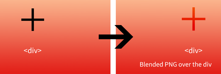
Here a Codepen to illustrate what I'm trying to do: http://codepen.io/anon/pen/zxOXGP Notice the Black Icon. I wanna overlay this.

2

There are 2 answers

1
Huub Hermsen On BEST ANSWER

Try using mix-blend-mode instead of background-blend-mode and switch to simple text for the plus-sign or a webfont for more custom figures.

Example Codepen of the below:

.placeholder {
  position: relative;
  width: 400px;
  height: 300px;
  background-image: -moz-linear-gradient(#ff0000, #0000ff);
  background-image: -webkit-linear-gradient(#ff0000, #0000ff);
  background-image: linear-gradient(#ff0000, #0000ff);
}
.center {
  position: absolute;
  top: 25%;
  width: 100%;
  font-size: 120px;
}
.center span {
  display: block;
  text-align: center;
  color: red;
  mix-blend-mode: screen;
}
<div class="placeholder">
  <div class="center"><span>+</span>
  </div>
</div>

2
misterManSam On

The gradient sandwich

Ingredients

  • The :before forms the bottom z-layer with z-index: 1, it is full opacity

  • The .content div forms the filling, central z-layer, with z-index: 2. It needs position: relative to take its z-index.

  • The :after forms the top z-layer with z-index: 3 and completes our lunch item. It is half opacity.

This is the tasty result:

Sandwich result

Full Example

I have removed all but the standard CSS3 gradient for simplicity. View in a supporting browser.

.gradient {
  position: relative;
  height: 200px;
  padding: 20px;
}
.gradient:before,
.gradient:after {
  position: absolute;
  top: 0;
  left: 0;
  width: 100%;
  height: 100%;
  content: '';
  display: block;  
  background-size: 100%;
  background-image: linear-gradient(to bottom, #24cae4 0%, #1f81e3 100%);
  opacity: 0.5;
}
.gradient:before {
  opacity: 1;
  z-index: 1;
}
.gradient:after {
  z-index: 3;
}
.overlayed_image {
  position: relative;
  width: 64px;
  height: 64px;
  display: block;
  margin: auto;
  background-size: contain;
  background-repeat: no-repeat;
  background-position: 50% 50%;
  background-image: url(http://cdn.flaticon.com/png/256/9029.png);
}

.content {
  position: relative;
  z-index: 2;
}
<div class="gradient">
  <div class="content">
    You can see me! 
    <div class="overlayed_image"></div>
  </div>
</div>