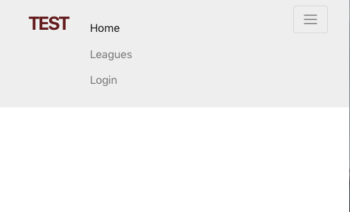
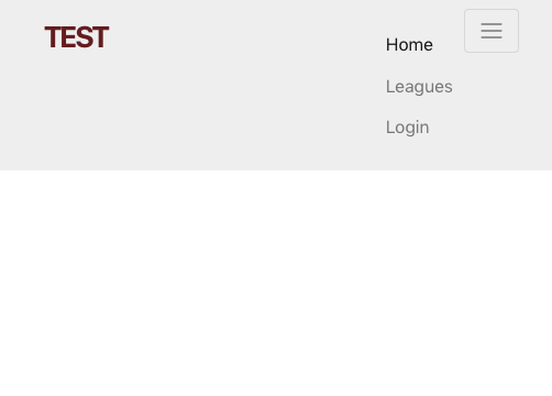
I got a question about BS4 and the alignment of a collapsible Menu.
Here is the Code I got:
<nav class="navbar navbar-light navbar-fixed-top">
  <div class="container">

    <button type="button" class="navbar-toggler hidden-sm-up pull-xs-right"
            data-toggle="collapse" data-target=".nav-content">
              <span class="icon-bar"></span>
              <span class="icon-bar"></span>
              <span class="icon-bar"></span>
    </button>
    <a class="navbar-brand" href="#">Test</a>

    <div class="collapse navbar-toggleable-xs nav-content">
      <ul class="nav navbar-nav">
        <li class="nav-item">
          <a class="nav-link active" href="#">Home</a>
        </li>
        <li class="nav-item">
          <a class="nav-link" href="#">Leagues</a>
        </li>
        <li class="nav-item">
          <a class="nav-link" href="#">Login</a>
        </li>
      </ul>
    </div>
  </div>
</nav>
The Problem is, that I want to have the Menu Items (when not collapsed) aligned to the right and when collapsed, to the left side but below the Hamburger Button and the main nav. It worked fine with BS 3.
I've tried it with float-xs-right, but the it still doesn't work properly.
Kind regards, Chris

Depending on which version you're using of Bootstrap 4, the syntax has changed to float-**-right (See Responsive floats) as of the current v4.0.0-alpha.5, see this post under Utilities overhaul.
Another issue is when using a Responsive (float) utility against the
navbar-togglerbutton, the list items will appear next the thenavbar-brandinstead of below it. As of right now I believe you have to handle this yourself by clearing the float within the correct breakpoint for your collapse.Example CSS:
Working Example: