(bootstrap grid col-md-4) alignment not working

431 views Asked by At

I have the following issue displaying a page on Chrome and wondering if you encountered it as well.. Have you faced the following inconsistencies and how did you mitigate them?

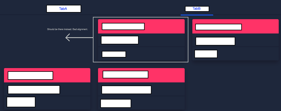
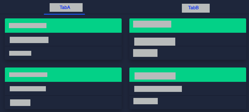
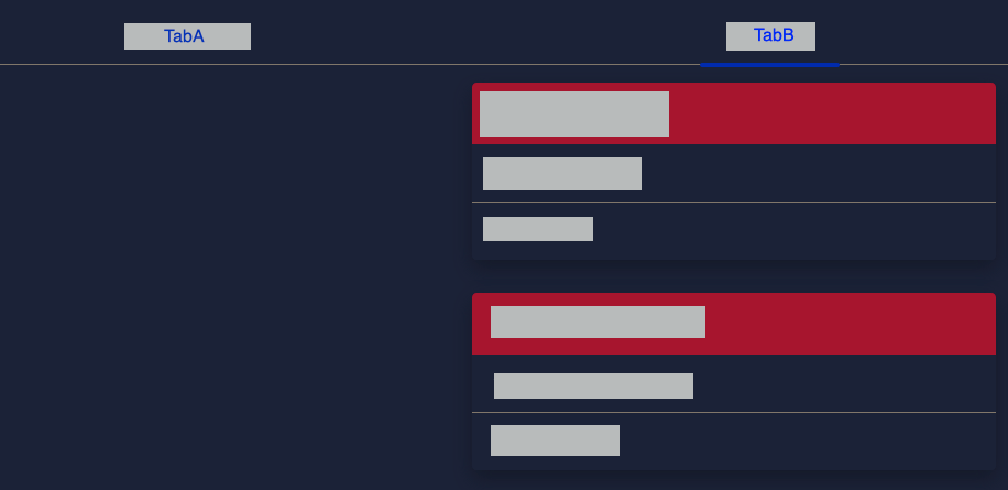
In Chrome, one of my Nebular HTML tabs(TabB) is not left justified.

Although in TabA , using the same code, elements are left justified.

In Firefox, TabB as a completely different layout.

Also I noticed that whenever I change TabB bootstrap code let's say from col-md-4 to col-md-9, the alignment changes in Firefox but not in Chrome..I tried clearing Chrome cache and restart, still no luck.

Here is my code. Thanks in advance!!
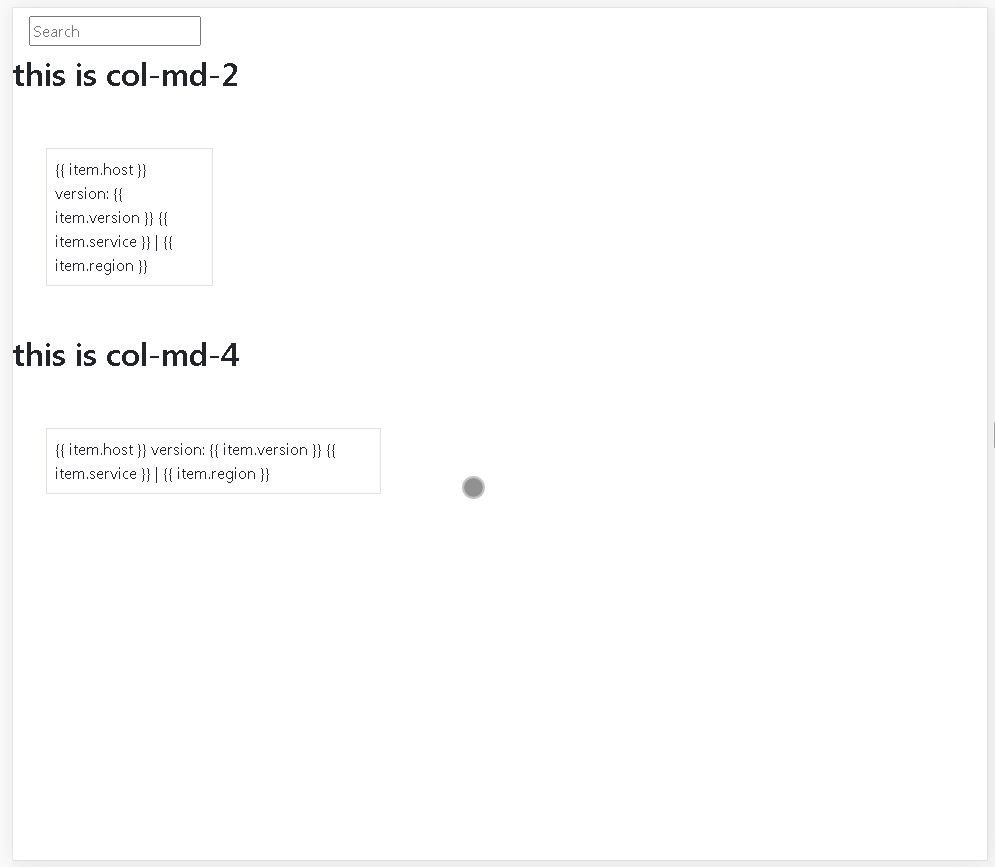
<nb-card>
<nb-card-header>
        <input nbInput id="search" class="search-input" placeholder="Search" #box (keyup)="onKey(box.value)">
</nb-card-header>
   
<nb-card-body>
    <nb-tabset fullWidth>
        <nb-tab tabTitle="TabA">
            <div class="row">
                <div class="col-md-4" *ngFor="let item of list_of_detail">
                    <nb-card status="success" *ngIf="item.env == 'A'">
                        <nb-card-header> {{ item.host }}</nb-card-header>
                        <nb-card-body>
                            version: {{ item.version }}
                        </nb-card-body>
                        <nb-card-footer>{{ item.service }} | {{ item.region }}</nb-card-footer>
                    </nb-card>
                </div>
            </div>
        </nb-tab>

        <nb-tab tabTitle="TabB">
            <div class="row">
                <div class="col-md-4" *ngFor="let item of list_of_detail">
                    <nb-card status="danger" *ngIf="item.env == 'B'">
                        <nb-card-header> {{ item.host }}</nb-card-header>
                        <nb-card-body>
                            version: {{ item.version }}
                        </nb-card-body>
                        <nb-card-footer>{{ item.service }} | {{ item.region }}</nb-card-footer>
                    </nb-card>
                </div>
            </div>
        </nb-tab>

....

2

There are 2 answers

10
AdDev On

Please Verify your code is like this Now updated the code -- you can view the difference now

    <!DOCTYPE html>
<html lang="en">
<head>
    <meta charset="UTF-8">
    <meta name="viewport" content="width=device-width, initial-scale=1.0">
    <title>Document</title>
    <!--bootstrap 4.0----> <!---this is importent--->
<link rel="stylesheet" href="https://stackpath.bootstrapcdn.com/bootstrap/4.3.1/css/bootstrap.min.css" integrity="sha384-ggOyR0iXCbMQv3Xipma34MD+dH/1fQ784/j6cY/iJTQUOhcWr7x9JvoRxT2MZw1T" crossorigin="anonymous">

</head>
<style>
.border{
    border: 1px solid gray;
}
</style>
<body>


    <nb-card>
        <nb-card-header>
                <input nbInput id="search" class="search-input ml-3 mt-2 mb-2" placeholder="Search" #box (keyup)="onKey(box.value)">
        </nb-card-header>
           
        <nb-card-body>
           
            <nb-tabset fullWidth>
                <nb-tab tabTitle="TabA"> 
                    <div class="row">
                        <div class="col-md-2 col-sm-12 p-2 m-5 border" *ngFor="let item of list_of_detail">
                            <nb-card status="success" *ngIf="item.env == 'A'"> 
                                <nb-card-header> {{ item.host }}</nb-card-header>
                                <nb-card-body>
                                    version: {{ item.version }}
                                </nb-card-body>
                                <nb-card-footer>{{ item.service }} | {{ item.region }}</nb-card-footer>
                            </nb-card>
                        </div>
                    </div>
                </nb-tab>
        
                <nb-tab tabTitle="TabB"> 
                    <div class="row">
                        <div class="col-md-4 col-sm-12 p-2 m-5 border" *ngFor="let item of list_of_detail">
                            <nb-card status="danger" *ngIf="item.env == 'B'">
                                <nb-card-header> {{ item.host }}</nb-card-header>
                                <nb-card-body>
                                    version: {{ item.version }}
                                </nb-card-body>
                                <nb-card-footer>{{ item.service }} | {{ item.region }}</nb-card-footer>
                            </nb-card>
                        </div>
                    </div>
                </nb-tab>


    <!-----Bootstrap--> <!---this is importent--->
<script src="https://code.jquery.com/jquery-3.3.1.slim.min.js" integrity="sha384-q8i/X+965DzO0rT7abK41JStQIAqVgRVzpbzo5smXKp4YfRvH+8abtTE1Pi6jizo" crossorigin="anonymous"></script>
<script src="https://cdnjs.cloudflare.com/ajax/libs/popper.js/1.14.7/umd/popper.min.js" integrity="sha384-UO2eT0CpHqdSJQ6hJty5KVphtPhzWj9WO1clHTMGa3JDZwrnQq4sF86dIHNDz0W1" crossorigin="anonymous"></script>
<script src="https://stackpath.bootstrapcdn.com/bootstrap/4.3.1/js/bootstrap.min.js" integrity="sha384-JjSmVgyd0p3pXB1rRibZUAYoIIy6OrQ6VrjIEaFf/nJGzIxFDsf4x0xIM+B07jRM" crossorigin="anonymous"></script>
<!---this is importent--->
    
</body>
</html>

you must add css file

 <!---bootstrap 4.0----> <!---this is importent--->
    <link rel="stylesheet" href="https://stackpath.bootstrapcdn.com/bootstrap/4.3.1/css/bootstrap.min.css" integrity="sha384-ggOyR0iXCbMQv3Xipma34MD+dH/1fQ784/j6cY/iJTQUOhcWr7x9JvoRxT2MZw1T" crossorigin="anonymous">

And the script is

<!-----Bootstrap--> <!---this is importent--->
    <script src="https://code.jquery.com/jquery-3.3.1.slim.min.js" integrity="sha384-q8i/X+965DzO0rT7abK41JStQIAqVgRVzpbzo5smXKp4YfRvH+8abtTE1Pi6jizo" crossorigin="anonymous"></script>
    <script src="https://cdnjs.cloudflare.com/ajax/libs/popper.js/1.14.7/umd/popper.min.js" integrity="sha384-UO2eT0CpHqdSJQ6hJty5KVphtPhzWj9WO1clHTMGa3JDZwrnQq4sF86dIHNDz0W1" crossorigin="anonymous"></script>
    <script src="https://stackpath.bootstrapcdn.com/bootstrap/4.3.1/js/bootstrap.min.js" integrity="sha384-JjSmVgyd0p3pXB1rRibZUAYoIIy6OrQ6VrjIEaFf/nJGzIxFDsf4x0xIM+B07jRM" crossorigin="anonymous"></script>
    <!---this is importent--->

You will get the answer like you can view the code like this..

View image In Full Screen

2
AdDev On

i hope you know that the col-sm effected for small devices only , not in your computer screen .|

At Bootstrap 4, you can drop the "xs-" indicator for the lowest breakpoint:

<div class="row">
<div class="col-2 col-sm-3">Something here</div>
<div class="col-10 col-sm-9">Something else here</div>
</div>

Part of the "mobile first" mentality.

Uses..

.col- Extra small (this code is for extra small deive screen eg: small android devises)

.col-sm- Small (this code is for small deive screen eg: latest smart phones)

.col-md- Medium (this code is for medium size deive screen )

.col-lg- Large (this code is for large size deive screen eg: Computer screen)

.col-xl- Extra Large (this code is for extra large size deive screen eg: android tv or other big larger screen)

the Bootstrap col is mean how to display a content in different size of screens | you can set muliple class with class="col-sm-12 col-md-6 col-lg-4 col-2". and now this will show in differently in different devises....

if you cant creat it well, i recoment you to download Bootstrap themes from bootstrap's own website | or if you want to learn Bootstrap , i recoment you to w3schools.com/bootstrap4