How do I align a navbar item to right?
I want to have the login and register to the right. But everything I try does not seem to work.

This is what I have tried so far:
<div>around the<ul>with the atribute:style="float: right"<div>around the<ul>with the atribute:style="text-align: right"- tried those two things on the
<li>tags - tried all those things again with
!importantadded to the end - changed
nav-itemtonav-rightin the<li> - added a
pull-sm-rightclass to the<li> - added a
align-content-endclass to the<li>
This is my code:
<div id="app" class="container">
  <nav class="navbar navbar-toggleable-md navbar-light bg-faded">
    <button class="navbar-toggler navbar-toggler-right" type="button" data-toggle="collapse" data-target="#navbarNavDropdown" aria-controls="navbarNavDropdown" aria-expanded="false" aria-label="Toggle navigation">
      <span class="navbar-toggler-icon"></span>
    </button>
    <a class="navbar-brand" href="#">Navbar</a>
    <ul class="navbar-nav">
      <li class="nav-item active">
        <a class="nav-link" href="#">Home <span class="sr-only">(current)</span></a>
      </li>
      <li class="nav-item">
        <a class="nav-link" href="#">Features</a>
      </li>
      <li class="nav-item">
        <a class="nav-link" href="#">Pricingg</a>
      </li>
    </ul>
    <ul class="navbar-nav " >
      <li  class="nav-item">
        <a class="nav-link" href="{{ url('/login') }}">Login</a>
      </li>
      <li  class="nav-item">
        <a class="nav-link" href="{{ url('/register') }}">Register</a>
      </li>
    </ul>
  </nav>
  @yield('content')
</div>

Bootstrap 5 (update 2021)
In Bootstrap 5 (see this question),
ml-autohas been replaced withms-autoto representstartinstead ofleft. Since the Navbar is still based on flexbox, auto margins OR flexbox utility classes are still used to align Navbar content.For example, use
me-auto...Bootstrap 5 right align Navbar content
Bootstrap 4 (original answer)
Bootstrap has many different ways to align navbar items.
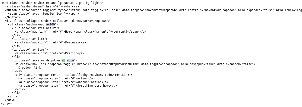
float-rightwon't work because the navbar is nowflexbox.You can use
mr-autofor auto right margin on the 1st (left)navbar-nav. Alternatively,ml-autocould be used on the 2nd (right)navbar-nav, or if you just have a singlenavbar-nav.https://codeply.com/go/P0G393rzfm
There are also flexbox utils. For example use
justify-content-endon the collapse menu:Or when you have 2
navbar-navs, usejustify-content-betweeninnavbar-collapsewould work to even the space between the navbar-navs:Update for Bootstrap 4.0 and newer
As of Bootstrap 4 beta,
ml-autowill still work to push items to the right. Just be aware the thenavbar-toggleable-classes have changed tonavbar-expand-*Updated navbar right for Bootstrap 4
Another frequent Bootstrap 4 Navbar right alignment scenario includes a button on the right that remains outside the mobile collapse nav so that it is always shown at all widths.
Right align button that is always visible
Related: Bootstrap NavBar with left, center or right aligned items