Background with 100% viewport width inside fixed width container

1.5k views Asked by At

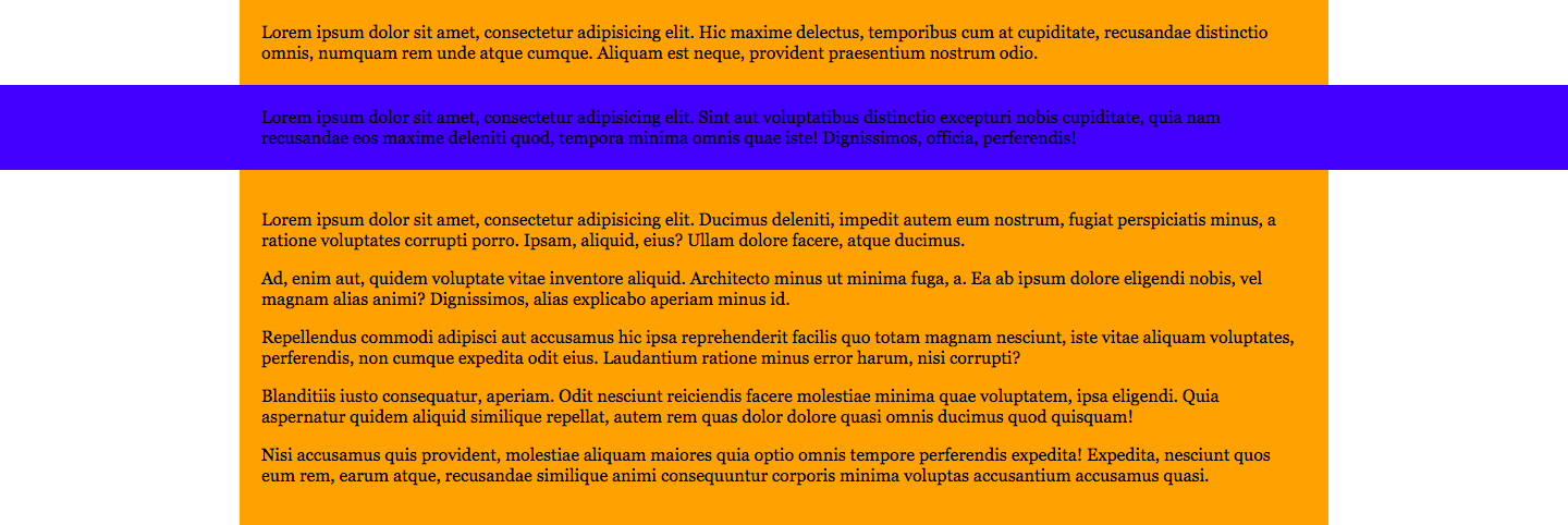
I have a container with 1000px width. On of the design items has a background of full-width (see blue bar on the image). Is it possible to put such background without additional markup?

Here's how it looks like:

enter image description here

And the markup I'd like to use:

<div class="container">
    <p>Lorem...</p>
    <p class="bar">Lorem</p>
    <p>Lorem...</p>
    <p>Lorem...</p>
    <p>Lorem...</p>
</div>

I tried to do it with absolutely positioned additional element and some extra tricks, like this:

.bar:after {
    position: absolute;
    top: 0;
    left: 50%;
    width: 100vw;
    height: 100%;
    background-color: blue;
    transform: translateX(-50%);
    z-index: -1;
}

It's almost good enough, except there's a problem to get it at the top of the container and not at the top of the contents of the blue bar. Plus, using extra element feels redundant.

It also can be done by placing the blue bar outside of the container, as parent and a child, but this way I will end up putting the 1000px value three times: for the div above the blue one, for the div inside blue one and for the div under the blue one.

Is there some way to achieve this effect to avoid repeating container's width and without any additional markup?

4

There are 4 answers

5
Stickers On BEST ANSWER

Here is CSS calc() approach. Since the container is fixed width, so you can use negative margin to make .bar full viewport width, and use same amount of positive padding for the correction of the vertical alignment of the text box (optional).

I put it into a media query make sure to check it out in a larger window.

Codepen

body {
  margin: 0;
}

@media (min-width: 1000px) {
  .container {
    width: 1000px;
    margin: 0 auto;
    background: pink;
  }
  .bar {
    margin: 0 calc(50% - 50vw);
    padding: 0 calc(50vw - 50%);
    box-sizing: border-box;
    background: gold;
  }
}
<div class="container">
  <div>Lorem...</div>
  <div class="bar">Lorem</div>
  <div>Lorem...</div>
  <div>Lorem...</div>
  <div>Lorem...</div>
</div>

Previous answer

body {
  margin: 0;
}

@media (min-width: 1000px) {
  .container {
    width: 1000px;
    margin: 0 auto;
    background: pink;
  }
  .bar {
    margin: 0 calc((1000px - 100vw) / 2);
    padding: 0 calc((100vw - 1000px) / 2);
    box-sizing: border-box;
    background: gold;
  }
}
<div class="container">
  <div>Lorem...</div>
  <div class="bar">Lorem</div>
  <div>Lorem...</div>
  <div>Lorem...</div>
  <div>Lorem...</div>
</div>

3
benbotto On

On approach would be to simply put the width on the p elements rather than the container, and then make a more specific style for the p.bar.

.container p {
  background-color: yellow;
  width: 1000px;
  margin-left: auto;
  margin-right: auto;
}

.container p.bar {
  background-color: blue;
  width: 100vw;
}

HTML:

<!DOCTYPE html>
<html>

  <head>
    <link rel="stylesheet" href="style.css">
    <script src="script.js"></script>
  </head>

  <body>
    <div class="container">
      <p>Lorem...</p>
      <p class="bar">Lorem</p>
      <p>Lorem...</p>
      <p>Lorem...</p>
      <p>Lorem...</p>
    </div>
  </body>

</html>

Plunker: https://plnkr.co/edit/IDiqCuampcDbA2nu8Ui6?p=preview

9
Caleb Swank On

I think a better solution would be to do something like this. You could still keep your original code but dont have to deal with absolutely position elements inside a body of text. much cleaner and you can edit the width of bar to be whatever you want, I merely made it 150%, use 100vw if you want max-width of the screen.

.container {
  width: 1000px;
  background-color: grey;
  margin: 0 auto;
  .bar {
    padding: 0 25%;
    width: 150%;
    box-sizing: border-box;
    background-color: blue;
    left: -25%;
    position: relative;
  }
}
1
Johannes On

You can do it ike this: Use a relative position on that element, 100vw width and left: calc((100vw - 500px) / 2 * -1); to move it the left side by exactly the distance from the left window border: (where that pixel value is the width of the container - here I took 500px to fit it into the snippet)

* {
box-sizing: border-box;
}
html,
body {
  margin: 0;
  background: #fafafa;
}

.container {
  width: 500px;
  margin: 0 auto;
}

.bar {
  position: relative;
  left: calc((100vw - 500px) / 2 * -1);
  width: 100vw;
  background-color: #fa0;
  padding: 5px;
}
<div class="container">
  <p>Lorem ipsum dolor sit amet, consectetuer adipiscing elit. Aenean commodo ligula eget dolor. Aenean massa. </p>

  <p class="bar">Donec quam felis, ultricies nec, pellentesque eu, pretium quis, sem. Nulla consequat massa quis enim. Donec pede justo, fringilla vel, aliquet nec, vulputate eget, arcu. In enim justo, rhoncus ut, imperdiet a, venenatis vitae, justo.</p>

  <p>Nullam dictum felis eu pede mollis pretium. Integer tincidunt. Cras dapibus. Vivamus elementum semper nisi. Aenean vulputate eleifend tellus. </p>

Yet another solution would be to use negative margins using that same calc value. That way you can leave out position: relative:

* {
box-sizing: border-box;
}
html,
body {
  margin: 0;
  background: #fafafa;
}

.container {
  width: 500px;
  margin: 0 auto;
}

.bar {
  margin-left: calc((100vw - 500px) / -2);
  margin-right: calc((100vw - 500px) / -2);
  background-color: #fa0;
  padding: 5px;
}
<div class="container">
  <p>Lorem ipsum dolor sit amet, consectetuer adipiscing elit. Aenean commodo ligula eget dolor. Aenean massa. </p>

  <p class="bar">Donec quam felis, ultricies nec, pellentesque eu, pretium quis, sem. Nulla consequat massa quis enim. Donec pede justo, fringilla vel, aliquet nec, vulputate eget, arcu. In enim justo, rhoncus ut, imperdiet a, venenatis vitae, justo.</p>

  <p>Nullam dictum felis eu pede mollis pretium. Integer tincidunt. Cras dapibus. Vivamus elementum semper nisi. Aenean vulputate eleifend tellus. </p>