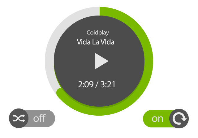
I am trying to implement the below UI. I am using Eclipse with ADT plugin.
The below is the implementation of the circle [White + Dark Gray] (circle_shape.xml):
<?xml version="1.0" encoding="utf-8"?>
<layer-list xmlns:android="http://schemas.android.com/apk/res/android">
    <item android:id="@android:id/background">
        <shape android:shape="ring" android:innerRadius="65dp" android:thickness="10dp"
            android:useLevel="false">
            <solid android:color="@android:color/white" />
        </shape>
    </item>
    <item android:id="@android:id/progress">
        <shape android:shape="ring" android:innerRadius="57dp" android:thickness="8dp" android:useLevel="false">
            <solid android:color="#FF393939" />
        </shape>
    </item>
</layer-list>
and the progress bar [Green] (circle_progress_bar.xml)as:
<?xml version="1.0" encoding="utf-8"?>
<rotate xmlns:android="http://schemas.android.com/apk/res/android" android:fromDegrees="270" android:toDegrees="270">
    <shape android:innerRadius="65dp" android:shape="ring" android:thickness="10dp">
        <gradient android:angle="0" android:endColor="#FF00FF00" android:startColor="#FF00FF00" android:type="sweep" android:useLevel="false" />
    </shape>
</rotate>
In the layout xml file as :
<ProgressBar
    android:id="@+id/progressBar"
    style="?android:attr/progressBarStyleHorizontal"
    android:layout_width="200dp"
    android:layout_height="200dp"
    android:layout_alignBottom="@+id/repeat"
    android:layout_centerHorizontal="true"
    android:layout_marginBottom="36dp"
    android:background="@drawable/circle_shape"
    android:indeterminate="false"
    android:max="100"
    android:progress="65"
    android:progressDrawable="@drawable/circular_progress_bar" />
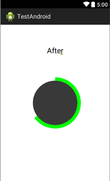
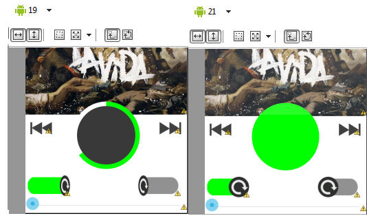
Problem 1: The above code gives me exact shape as I want, but only with API 19 and API 20. As soon as I switch the preview mode in Eclipse to API 21, the progressDrawable seems to fill up the full circle leaving up only single circle filled up with green colour. I am not able to figure how to do the same on Android L.
Problem 2: This is related to the switch buttons. In API 21, I can easily set
<android:textOn="" android:textOff="">
and the buttons look fine. However, if I view the same in API19, the Thumb drawable becomes distorted (squeezed) until I set some text using textOn and textOff attributes.
Can someone please help me with the same?
Please feel free to move / close the question if it doesn't seems constructive enough. But Kindly be kind to redirect me to some other helpful resource.
Edit 1:
The below is the screen shot for Problem 2
The XML for switch goes as following:
<Switch
        android:id="@+id/switch1"
        android:layout_width="wrap_content"
        android:layout_height="wrap_content"
        android:layout_alignBaseline="@+id/repeat"
        android:layout_alignBottom="@+id/repeat"
        android:layout_alignParentLeft="true"
        android:background="@drawable/toogle_selector"
        android:checked="true"
        android:thumb="@drawable/circle_1"
        android:track="@drawable/transparent"
        android:textOn=""
        android:textOff=""/>

Found the solution to your problem
in "Circular_progress_bar"
Because android:useLevel="true" is by default false is API Level 21
Before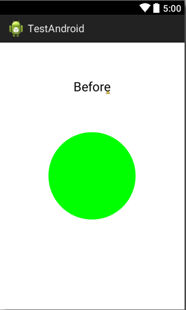
After